Monthly Archives: January 2015

Finished Nightstand Topper!

Berries with Lemon Action DONE HP
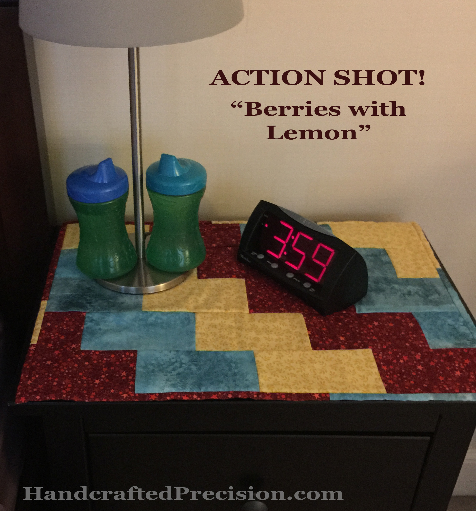
Done and in use, my first A Lovely Year of Finishes finish, the nightstand topper for my son Sec, “Berries with Lemon”!

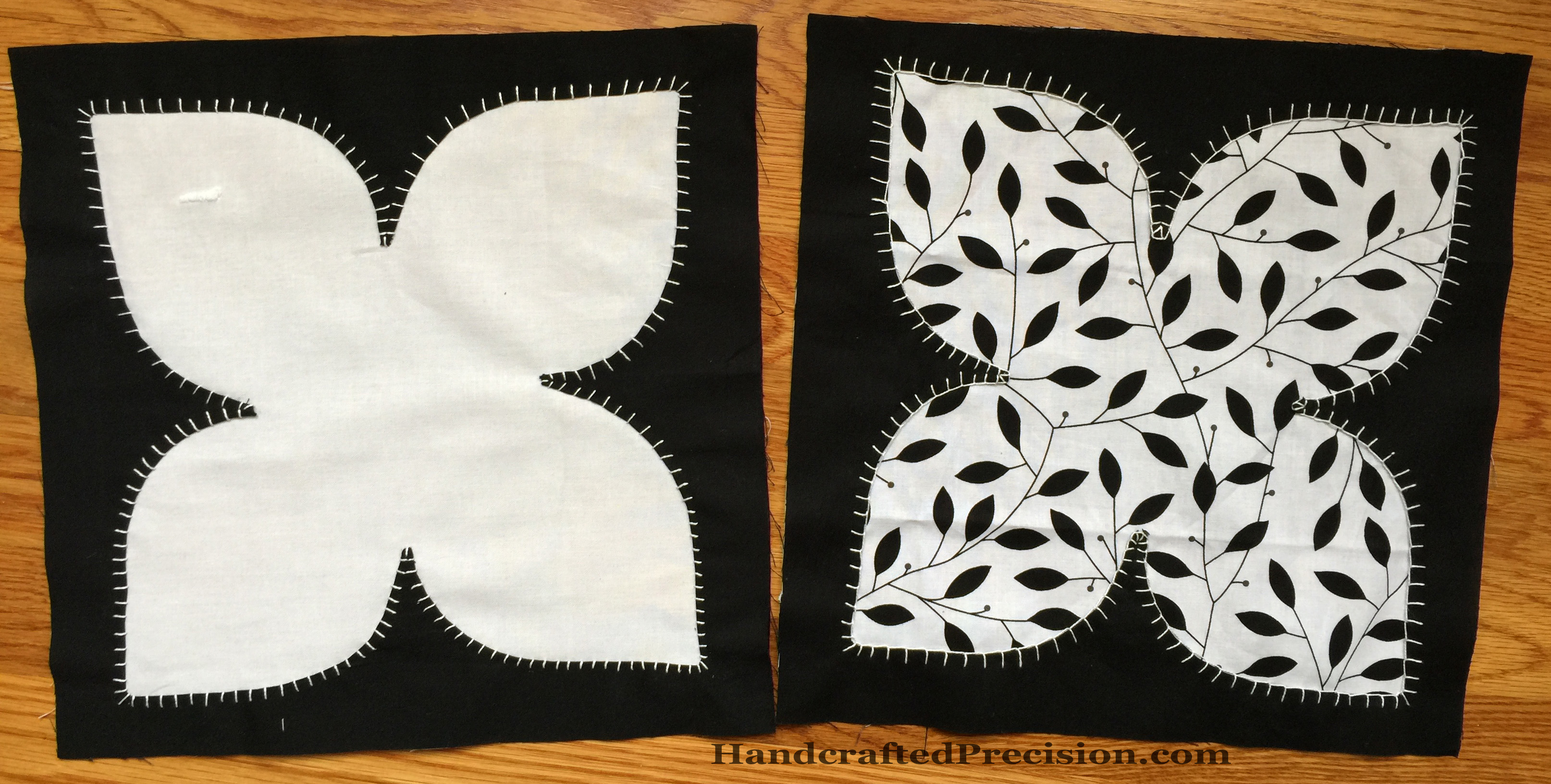
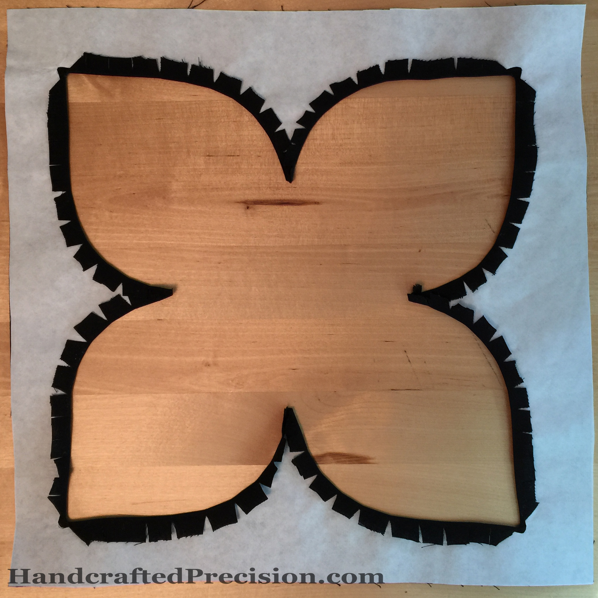
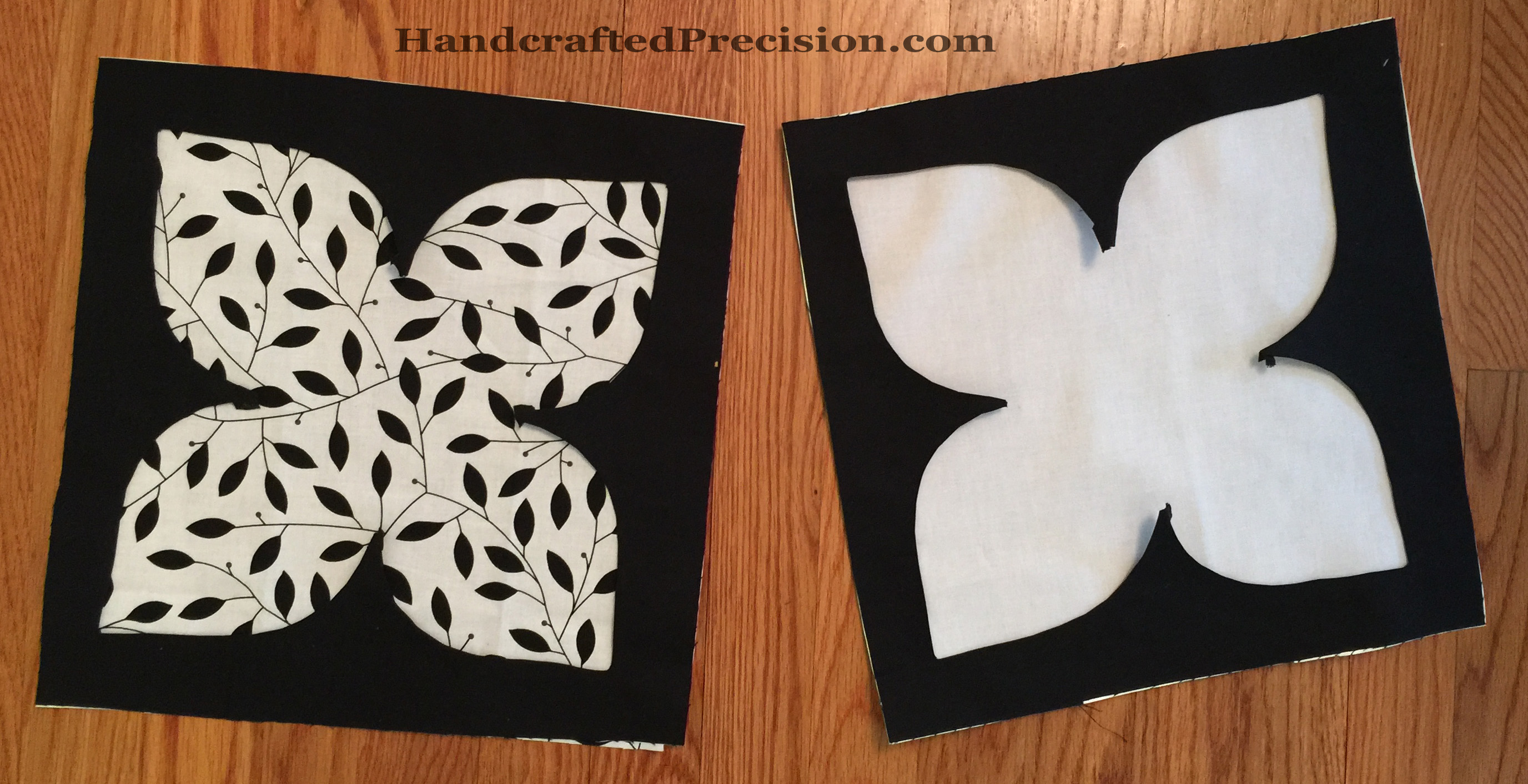
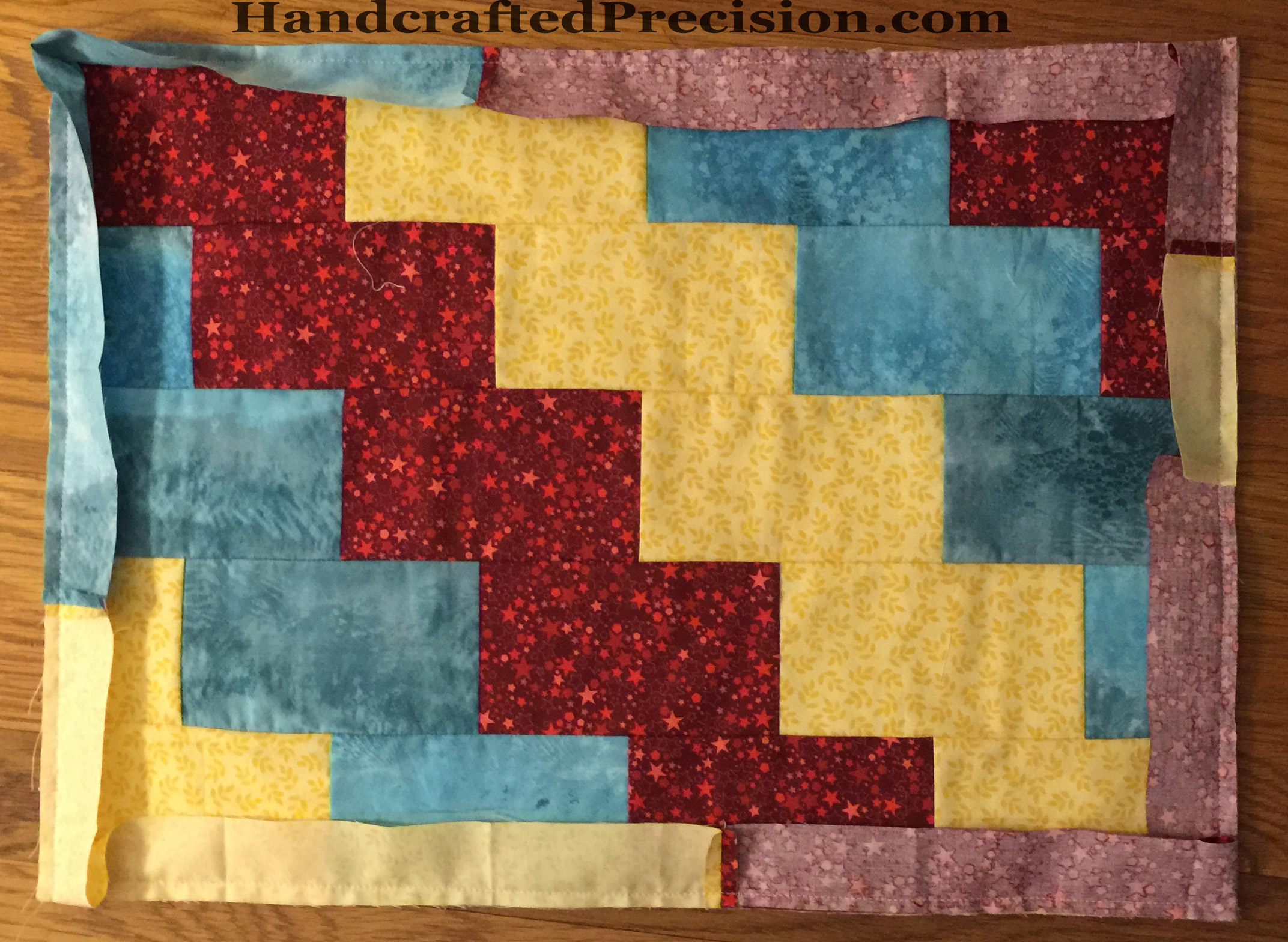
It all started with his fabric picks and here we are with a functional piece.

Berries with Lemon Front DONE HP

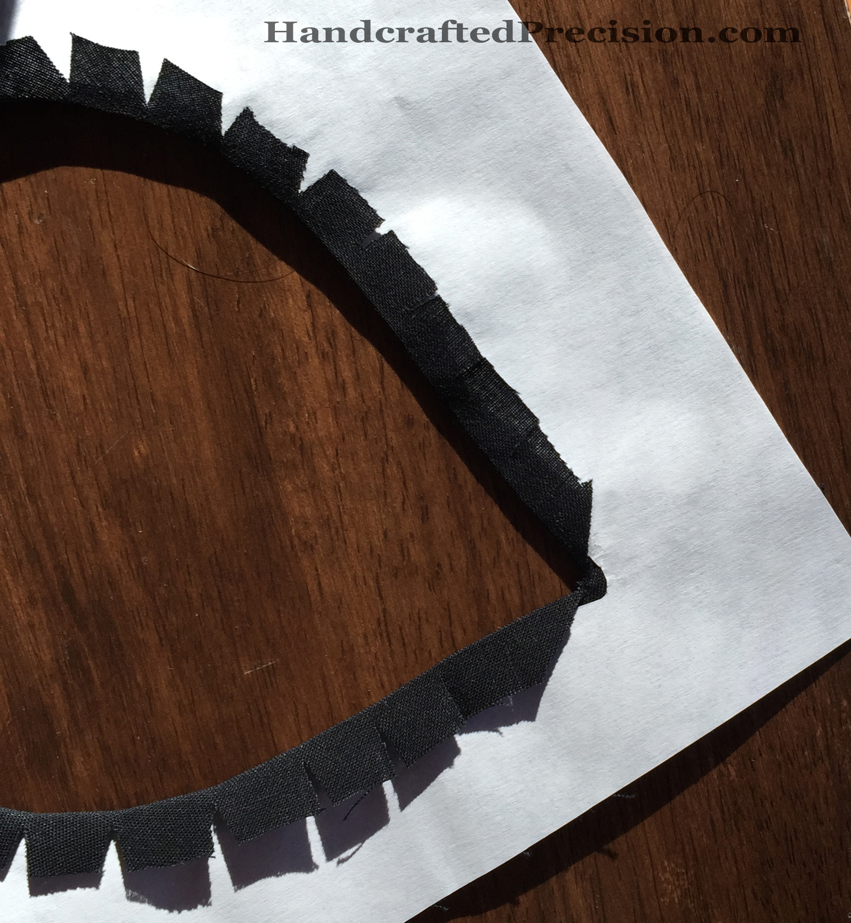
It’s a tiny bit wonky, but it almost perfectly fits his night stand.  I ended up just doing bar tacks at some of the brick intersections by hand.  It’s not going to be washed much (as you can see from the first picture, he doesn’t like putting his water cups on it), so it should hold together just fine.  No, he doesn’t really use the clock for anything.  He claimed it from another room and now it’s his.

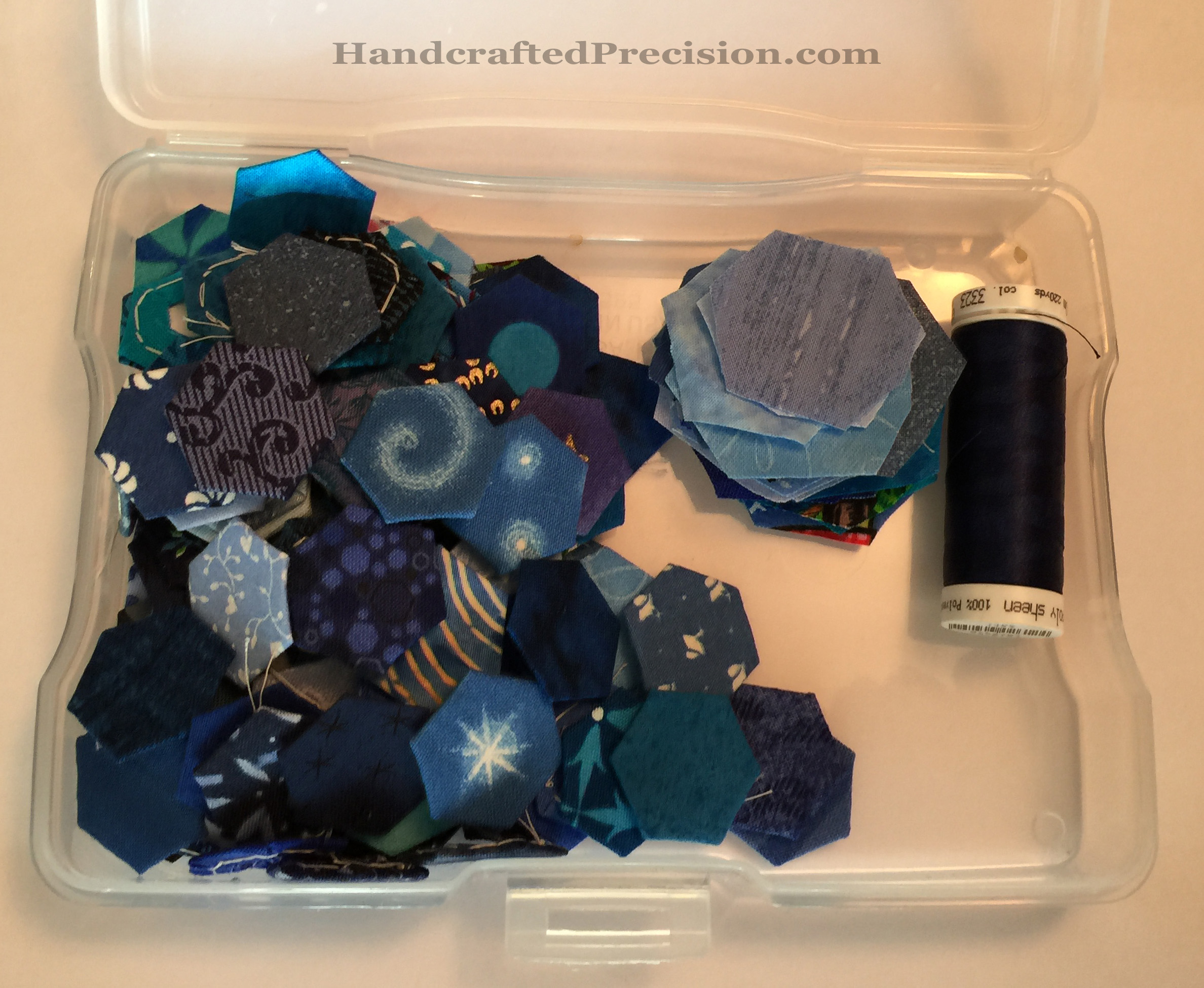
The bar tacks were partly because I couldn’t bear to drag out my sewing machine to do the quilting.  I despair of ever being able to sew a consistent, straight line without a struggle.  Good thing I like hand-sewing now, though burying the knots and ends of all of those bar tacks was no fun at all.

Berries with Lemon Back DONE HP
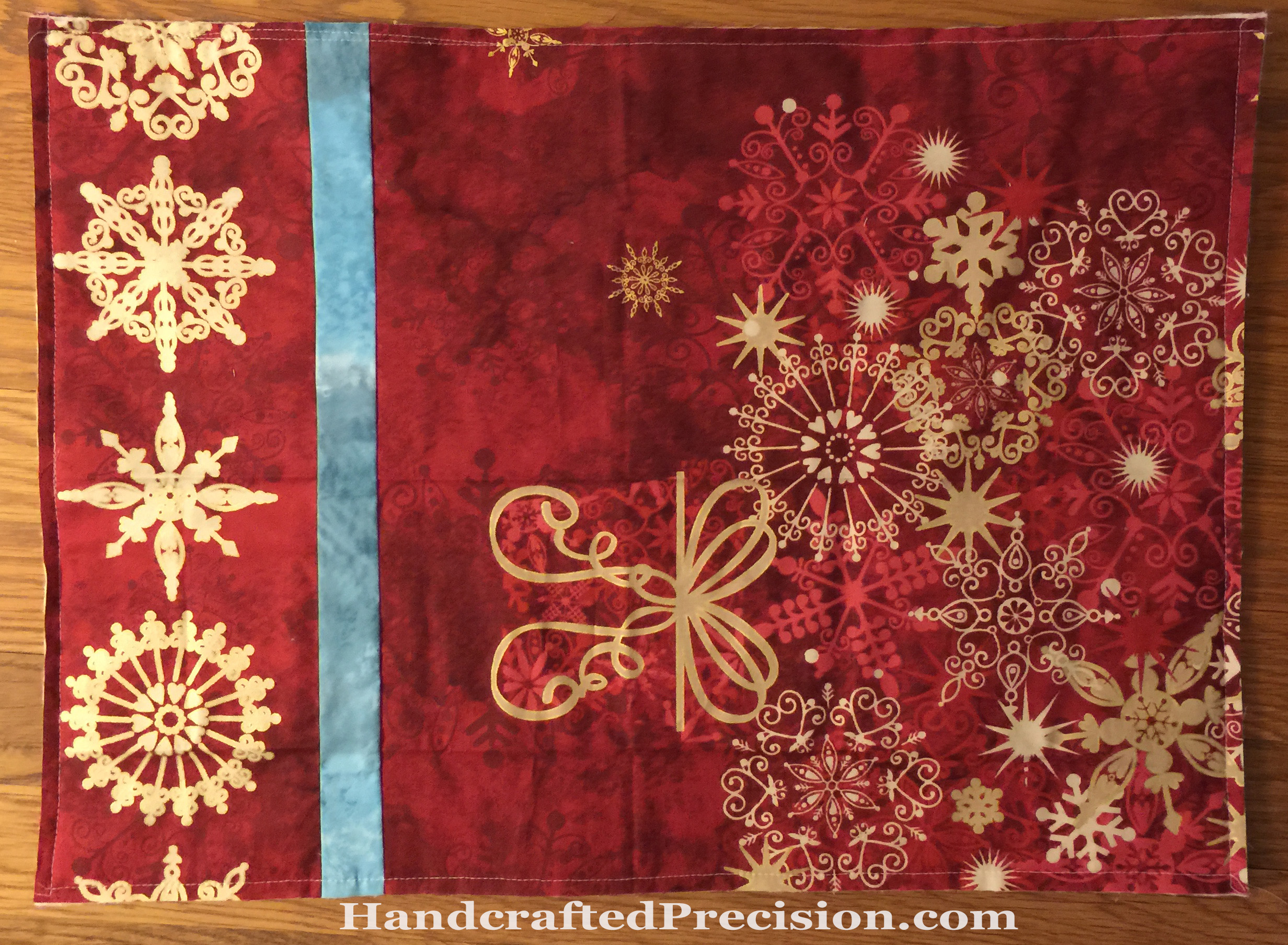
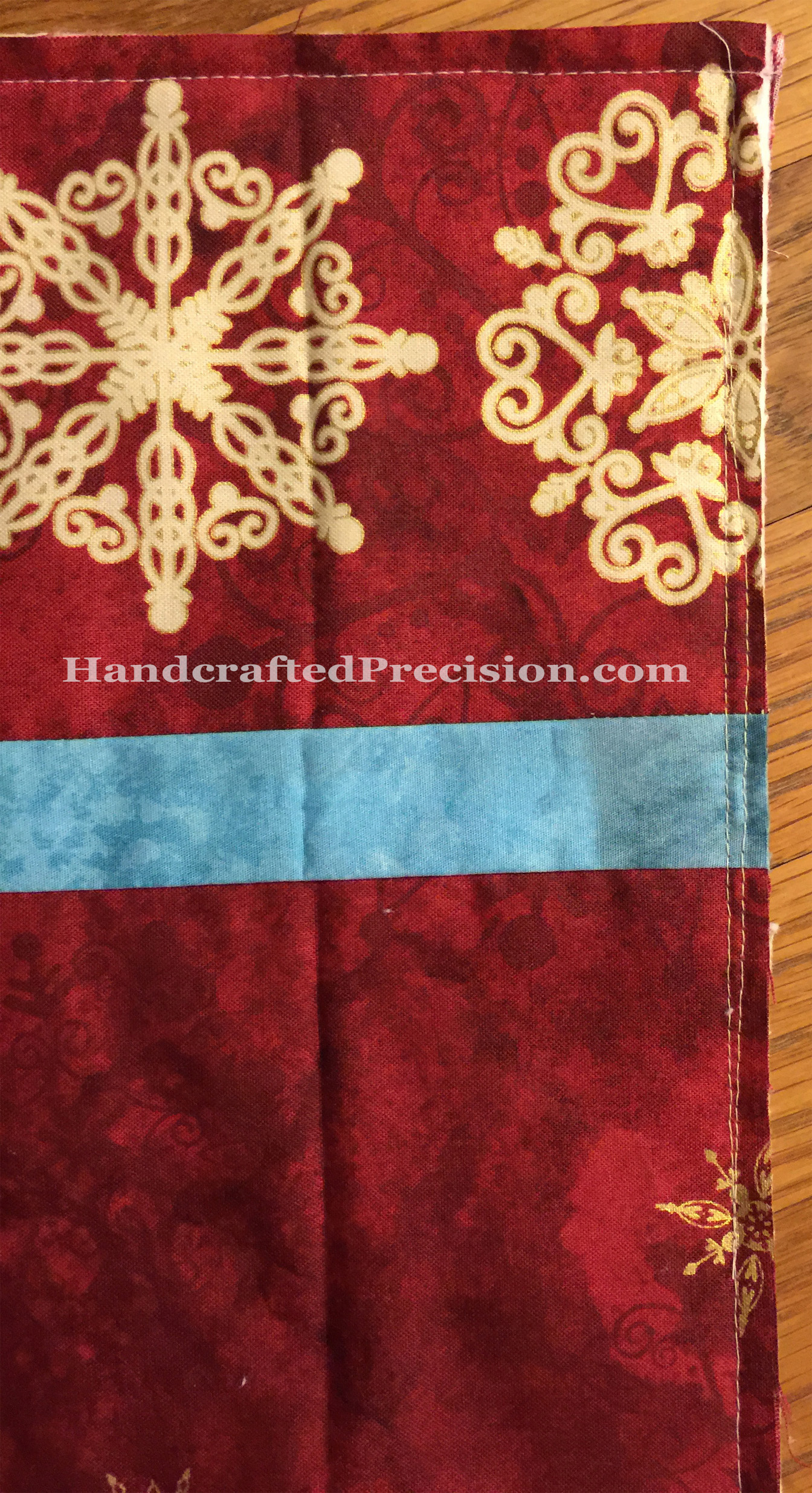
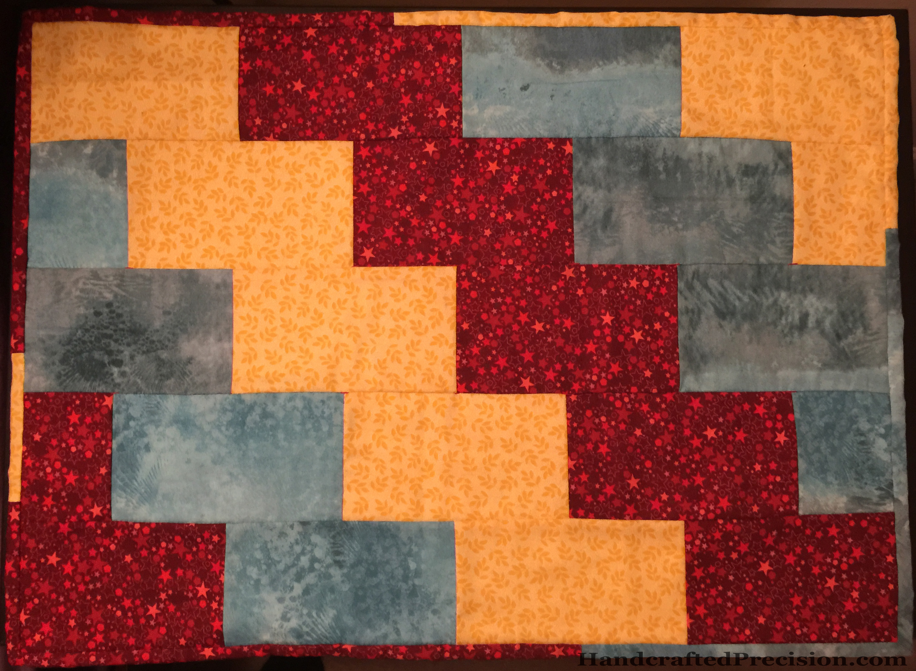
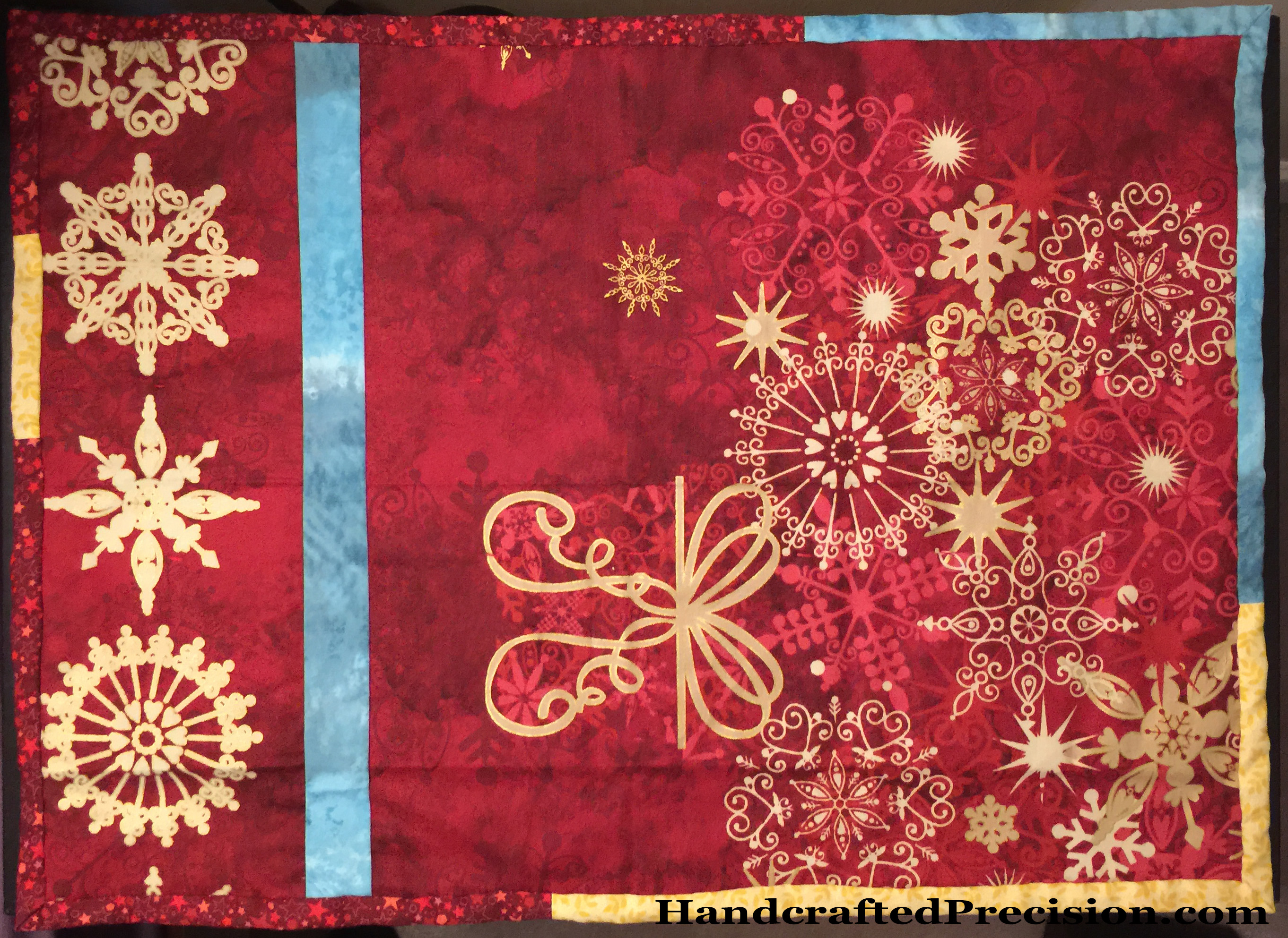
I do like the back.  I don’t want to mess it up with a big ugly white label and I’m not sure I can easily match the red for a Spoonflower-printed label, so we’ll see.

But it’s done and getting used, so YAY!

Linking up with ALYoF’s January finish post, just in time.

The Hexagon Diamonds Blues

The title is descriptive of the photo and of my mood.

Blue Hexagon Diamonds HP

The diamond on the right is pretty clearly light blue, though some hexagons are more greenish or greyish.  That just adds interest.  The one on the left is just barely darker than the “medium blue” one in the middle.

I’m not going to sew any of these up.  They’ll just go back into the “blue” container as loose, basted hexagons.

I do think that I learned I only need two shades of blue for I’m Not a Machine, though, and maybe greenish-blue, if I have enough fabrics in that shade, which I doubt.

All told, I learned a lot about color and value this month, even if I didn’t get much done besides basting.  I’m looking forward to next month’s color.  I hope it’s an easier one, like orange.

Linking to soscrappy’s RSC.

Class Quilt Fix?

I know.  I’m all over the place with this quilt (these quilts).  If I’m going to put this much hand work into something, I want it to be pretty and something I’ll actually use.

I realized that while I’m very excited about the process of learning and practicing all of the techniques, I’m not crazy about the pattern itself.  It’s a lovely pattern, it’s just not for me.  I’m not a super-flowery person and it wouldn’t go well with my decor (hence the outright rejection of color and trying to go black/white/grey with it).

I was also iffy about the embroidered row that we start next week.  I don’t like the dogwood “jewels” and I’m pretty sure the dense rows of dashes in the triangles would be boring and possibly take more time than I have.  I’m also worried that if I used it as a couch blanket that the stitches wouldn’t hold up well with use (especially little-kid use).

I also ended up hating both of my choices of fabric for the central medallions.  My solutions are pretty simple, though they involved more freezer paper and ironing, which I did not love.

New Center Ironed HP

Ta da!  A new central motif.  I’m going to use it with the black-on-white leaf fabric as the main focus.  Since it’ll be broken up into the little windows, the main focal point will be that black circle in the middle, which I can embroider/quilt some concentric circles in and all will be well.

I’m also going to replace the embroidered dogwood “jewels” with some more paper piecing and likely the other embroidery with HSTs.  I’m going to try some curves for the first time!  So I’ll still be learning and doing new techniques, but ones I’m excited about now.  (The embroidery isn’t a new technique for me–I’m sure I could execute it well, but I’m not looking forward to it, which is reason enough to skip it).

I’m only going to do one quilt and I’m going to use all three of the prints I’ve previously shown, as well as the greys I mentioned earlier in the week.

I’m feeling a lot better about this quilt!

1″ Hexagon Decisions

I’ve been basting fabrics from mini charm packs (and now charm packs, too) around 1″ hexagon papers and 1/2″ hexagon papers.

The 1/2″ hexagons are destined for my ongoing rainbow project “I’m Not a Machine“.  The ones that don’t fit into the color scheme (and duplicates of the ones that do) are going to become some general, scrappy projects, likely small ones, along the lines of notebook covers or doll quilts.

But I didn’t have a plan for the 1” hexagons.  I was worried that the fabrics from the different lines wouldn’t play well together and I didn’t have enough of any one to make a sizable project.  My sewing relative (SR) said that they’d look fine together and that the more different fabric packs I used, the better they’d all blend.

Four Charm Pack Hexagons HPShe was totally right.  Even without mixing up the different fabric lines, they look good together, though the one on the right will look best mixed in.

This simplifies my storage and construction options considerably.  I’ve decided that after I’ve taken a picture of the basted 1″ hexagons from a particular pack, I’ll store them all in a bin together.

1in Hexagon Bin HPThe bin’s pretty tall, so I can shake it around before I pick out individual hexagons to add to a project.  What am I going to make?

Pillow covers for the couch!  We’re using pillowcases now, which are easy to clean when the kids get stuff on them, but they’re ugly and it’s like we’re living in a frat house.  The pillows are 16″ squares, so I’ll need about a hundred to cover each pillow.  (CD Designs has a pretty good tool for figuring out how many of whatever-sized hexagon you’ll need to fill a specific space.)  The backs will be solid (for napping), and I’ll use an invisible zipper to close.  I’m going to machine quilt these babies, too.

I’d like to have a lot more hexagons in the bin before I finish a pillow, but I might pull some out soon and start sewing them together.  I also need to look at my scraps and see what I can fussy-cut for interest.

I love having a plan!

Class Quilt Medallion Problems

Welp, this quilt (or these quilts, as the case may be) is not going well at all.

Finished Blossoms HPSure, I have both medallions done.  I did a bigger stitch than Rachel’s pattern calls for, but those pointy inside corners are ugly.  I did a true blanket stitch on the patterned one and the white does help set off the black in the pattern a little from the black of the background, but neither is good.

And see that bright line in the upper left-hand part of the white blossom?

Cut Fabric HPYup.  It’s a cut in the fabric.  I have no idea how or when it happened.

I used some Fray Check on it then darned over it, which I thought was a better solution than appliqueing over it since I still want to do some dogwood embroidery and quilting on the white field, but the whole thing’s a disaster.  The only good part is that I really, really like the Q-Snap frame.  I’d only used wooden hoops before and this thing is a dream.

One more good part: I really like sewing with these needles and the pearl cotton.  They slip right through the fabric and the cotton is glossy and smooth.  I’d crocheted with it before but it’s really nice to sew with, too.

So now I have two centers that I hate (well, not HATE exactly, but they’re far from ideal).  I did cut some greys and white for the next rounds, so I guess I’m pressing forward.  I’ll only do the embroidery round on the white-center medallion (which I’ll likely call “Mended Heart” for obvious reasons) and make HSTs (half-square triangles) for the patterned-center medallion.

Class Quilt Reverse Applique

I’m not loving the reverse applique process so far, but I’m learning a lot.  Let’s start with a cool image.

Freezer Paper on Background HP

This is my black background fabric with the freezer paper adhered to it.  Remember this image, since I came to a realization about it further along in the process.

Reverse Applique Supplies HP

You really, really need that little brush for the starch.  I’m glad I had one handy.

Background Pressed HP

See those terrible corners, inside and outside?  Yeah, I really didn’t like doing this.

More pictures of the ugly, please excuse the shadows:Messy Corner HP       Messy Corners HP

Look at them with the “feature” fabric inside:Two Blossoms HP

Not terrible, but not great.  Why?  Because it’s a MEDALLION quilt and the very central fabric has to be outstanding, not necessarily a busy print, but it has to draw your eye, like the black center in the first photo above.

Duh, I said to myself, but I wasn’t about to jump ship and change plans.  That’s why you’re looking at two medallions.  I did the plain white one first, thinking I’d spice up the inside with embroidery and/or quilting (like a real dogwood blossom–lines on the petals and circles in the center), but it wasn’t grabbing me so I used the biggest black and white print I had, but that print’s not special enough to be the main focal point of the quilt.

I think I know how to fix them, but I need to get them stitched together first.

Class Quilt Fabrics

Greys for Class Quilt HP


Very few of the fabrics I got are a pure grey.  The one in the upper right is greenish and the ones in the middle on the bottom look beige (worse in the picture than in life), but that’s better than the blue-greys on the top.

If I want to work with close solids like this in the future, I think I’ll need to pick a fabric line and invest in a color card.  Fabric selection’s been way more difficult than it should have been.

I also have one more color of pearl cotton coming. I hope it’s more of a true grey than the blue-grey balls up top.

And the prints I got are still sitting in my sewing room, calling me.  I’m agonizing too much about this quilt and I haven’t even started yet.

“Berries with Lemon” Progress

I didn’t make as much progress on this nightstand topper for my son Sec as I would have liked, but some progress is better than none.  I got the binding sewn on the front.

Berries with Lemon Progress HP

I really, really like the back.  It’s much cooler than the front.  No label yet.  That’ll have to wait for my next Spoonflower order, so it might be some time.  It’s not going anywhere and I’ve documented it here, so I’m not too worried.

Berries with Lemon Progress Back HP

I actually made a bunch of mistakes with this project.

First, I didn’t make the backing significantly bigger than the front on all sides (there was some leeway on the long sides, but none on the short), so spray-basting it all together was a nightmare.  I was afraid that it would shift badly if I machine-quilted it, so I decided to hand quilt it, but I wanted to get the binding on while I had my machine out, so I did that.  It’s a little project, so I think it’ll be fine.  I think I’m only going to tack it all down at the corners of the squares.  Warm and White says you only need to quilt every 10″ and I don’t think it’s going to be washed often, so it’s likely okay.

Berries with Lemon Progress Oops HPSecond, you can see where my machine sewing failed when I was adding the binding.  I sewed too narrow a seam allowance, so it wasn’t hard to fix, just annoying.

I cut everything very carefully, had my (new) walking foot on, and went super-slow.  I’m beginning to think my 1/4″ seam allowance woes aren’t all me, but may be at least partially due to my machine.  I’m going to have to try out a new machine at the quilt shop.  I realized that I’m having no fun at all doing the piecing because I dread the wonky seams.

At this point, I’d rather hand-sew than drag out the machine.  <sigh>  I don’t want anything fancy, just a machine that feeds evenly.  Yes, I just had it serviced.  Argh.

Well, I only have hand-sewing left on this one and then it’s a finish!

Blue Hexagons

Thanks to all of the encouraging comments last week, I decided to pull two bits of every piece of blue fabric I have (even some that are clearly too greenish, too multicolored, or too greyish) and baste them up, then try to separate them into light, medium, and dark blue piles.

Blue Hexagons HPI’m actually basting with white thread.  The blue in the photo is in case I feel confident enough to sew a medium blue or dark blue diamond together.  I feel pretty confident that I can make a diamond from these hexagons that reads light blue to me, but I’m still worried about the lack of difference between dark blue and medium blue.

Well, that’s what experiments are for.  More basting!

Linking up to soscrappy’s RSC.

Handstitched Class Quilt Decisions

I’ve been agonizing too much about what I want to do for the Handstitched class quilt “Modern Medallion”–I’m going to call mine “Bold Tranquility” and I’ve tagged this post and the first with that name.

Black and White Prints HP

Even though I bought this third print, thinking to use it for the central dogwood blossom, I’ve decided not to use any prints at all, just fabric and pearl cotton for quilting in white, black, and a few greys.

If I hate how it’s turning out, I can make it into table topper and try again with the prints.

I got my freezer paper and my spray starch (and sizing, just in case).  Tomorrow, I’ll iron and start cutting.  I hope to do the hand sewing on the central dogwood blossom over the weekend, but I doubt I’ll be able to take my machine out for joining the next three rounds until Monday.