Author Archives: HP

The Pink that Wasn’t

Pink was February’s Rainbow Scrap Challenge color.  At the beginning of the month, I went through my eBay scraps and dug out all of the pinks.

Pink Fabrics HP

Look how bright and cheery.  I was super-excited.  I guess pink didn’t feel as personal to me as blue, so I was less worried about messing it up.  Also, there are fewer variations in pink, so what I had seemed to work together better than the blues did.

I cut into about half of the scraps for 1/2″ and 1″ hexagons and I started basting.

Pink Hexagons Cut HP

And that was it.  Cute, but not many.  The Handstitched class and my quilt Midnight Garden took over (not to mention all of the snow days and school vacations and sickness) and that was all for the pinks.  I looked at them all month, but I didn’t get anything else done.

I doubt I’ll even pull fabrics for March’s RSC color, because I have a LOT to do for Midnight Garden, but I’m sure I’ll still enjoy seeing what other people are doing.  I linked up with the RSC at soscrappy this week, even though I don’t have much to show.

Ugly Headband

I’ve been working my rear off on Midnight Garden, my quilt for the Handstitched class (I’ve almost got the center all sewn together!), but I’m only loosely following Rachel’s instructions for the Modern Medallion quilt.  This means that I’m way, way behind.  If I want the souvenir from the class (and I do), I need to make something from each week of the class.

Week 3 was embroidery.  I chose to EPP my “jewels” round of the quilt, so I made this headband instead:

Ugly Headband HP

I made it using materials I had on hand, and I did half-ass it, but it’s done.  (Yes, I used a paper towel as the backdrop.  Wanna fight?)  If I had to make a gift for a long-haired child I REALLY liked, I might make this without cutting any corners.  It was relatively quick to make and if I’d put more time and care into it (ie, measuring), it would have come out very nice.

Now, back to working on Midnight Garden.

Midnight Garden Medallion Progress

Quick picture for my Handstitched class camp people:

Midnight Garden Medallion Progress HP

It’s not all sewn together yet (though it looks like it’ll fit–especially after pressing and when the papers are out).  Yes, it’s all hand-sewn.  Yes, all over papers, EPP style.  Why?  I could not tell you, except that I was afraid of losing points on the medallion and I don’t trust my machine-sewing skills (or my machine) yet enough to risk it.  It’s taking FOREVER and I’m rushing, so it’s not fun.

On the plus side, I’m really liking it.  I don’t think it’ll end up square, though.  Maybe twin-sized, so they can lay it over me when I’m old, on my cot in the nursing home.  It might actually get done by then, too.

Sadly, I think I’m going to have to do some of the smaller projects (from weeks 2 and 5) so I can have something done from every week and get my tchotchke from Rachel.  But, on the plus side, if I’m taking my time, I’ll be able to like it again.  Yay.

Charm Pack – Pepe in Paris

I went back and finally finished the gluing and cutting and basting of this charm pack that Prim LOVED.  Picture time:

CP Pepe in Paris HPYou’ll see that I didn’t learn anything from last time: This “black” construction paper is a terrible background, so none of the colors are true.  It’s worse in the 1/2″ hexagon picture:

CP Pepe in Paris Small HPMy favorite has to be that tree in the upper right, which is unfortunately upside down in the picture.  My least favorite is the guy’s torso in the middle of the shot.  These prints didn’t work at all well for the 1/2″ hexagons, both since the patterns were too big and because they had too many colors in them to work with my I’m Not a Machine project.  Ah, well.  Live and learn.  Prim LOVES them.

Not pictured are the leftover 5″ x (mostly) 2.5″ strips which will eventually go into a scrappy coin quilt.  This charm pack was tied with a ribbon which went missing well before I had everything basted, let alone ready for their photos.

Did I mention that Prim LOVES this Pepe in Paris fabric?  (Yes, you did, HP, a bunch of times now.)  Well,  I got a yard each of the main print in pink and blue (I couldn’t find the white–my “local retailer” was all sold out, ages ago) for pillowcases.  He’s very excited about the idea.  I like this tutorial at Film in the Fridge for making fancy pillowcases with cuffs and NO RAW SEAMS!

I want to get started on them, but I need to finish a few other projects first, so they’ll have to wait a bit.

Class Quilt Anguish

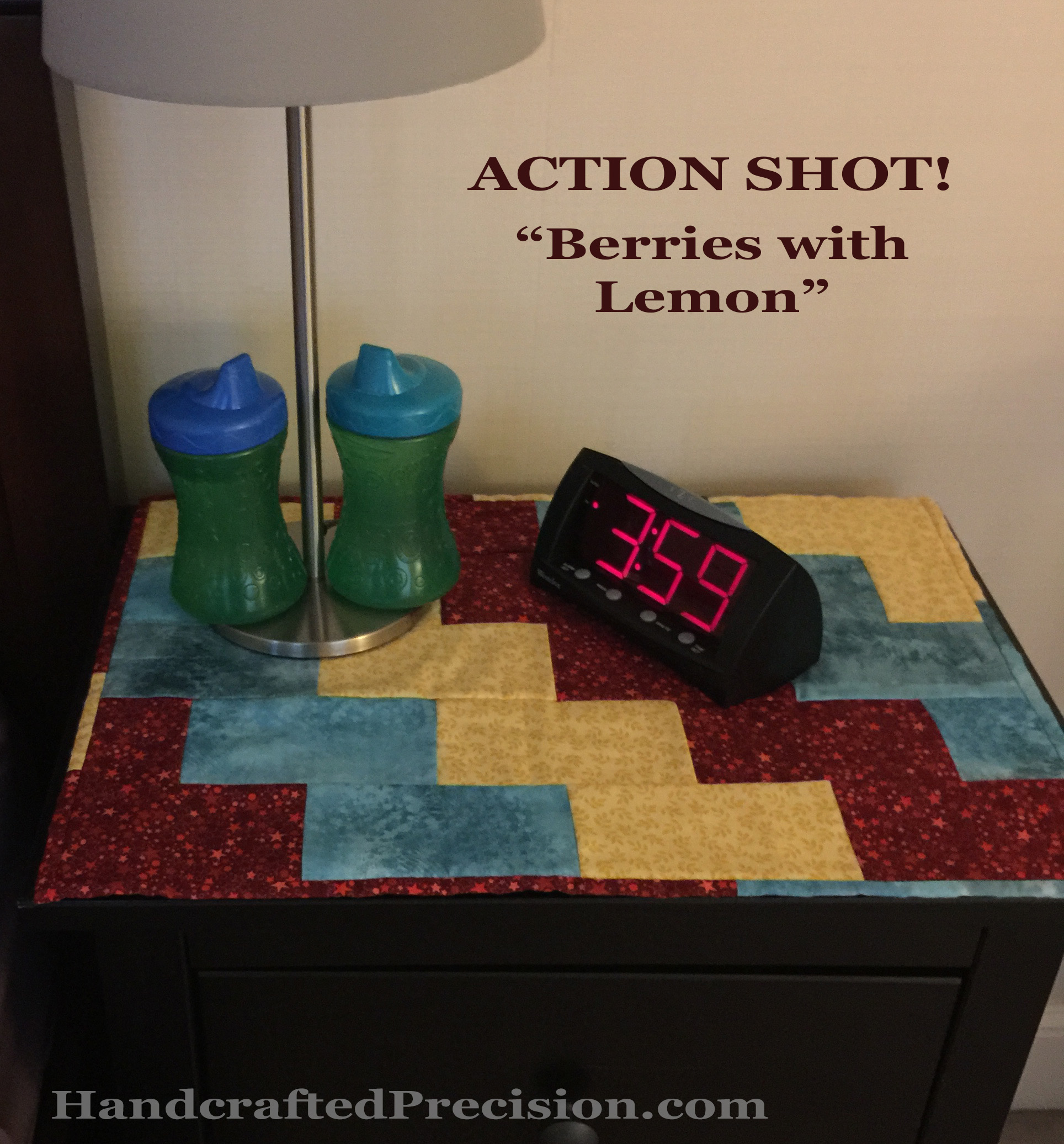
As I’ve documented, I’ve been going around and around with the class quilt for Stitched in Color’s Handstitched Class.  I think I’ve FINALLY settled on a plan, so enjoy a meander through my design process–with pictures!

The teacher’s version of the class quilt is called Modern Medallion and features lots of colors and prints (including one main large print at the center of the medallion), as well as a round densely embroidered with perle cotton (thicker and glossier than embroidery floss).  The main motifs are dogwood blossoms.  This quilt is lovely, as are many of her students’ variations.

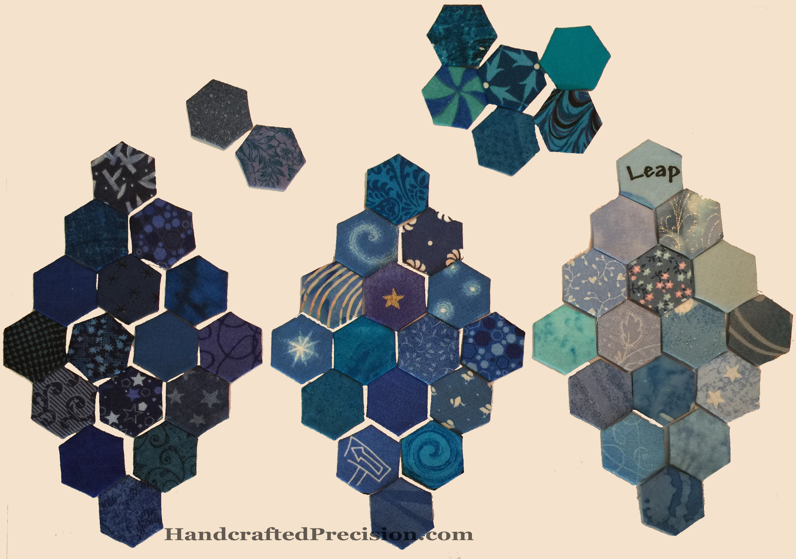
I started off gung-ho about it, central medallion and all, though I decided to do a greyscale version.  I picked fabrics.  I couldn’t decide on a white center for the medallion or not, so I made two.  I hated both of them.  I thought I figured out a new motif for the central medallion, but it didn’t work, so I decided on a circle with a featured print, but I had no suitable print so I ordered a few and hoped for the best.

Boring Print in Circle HP

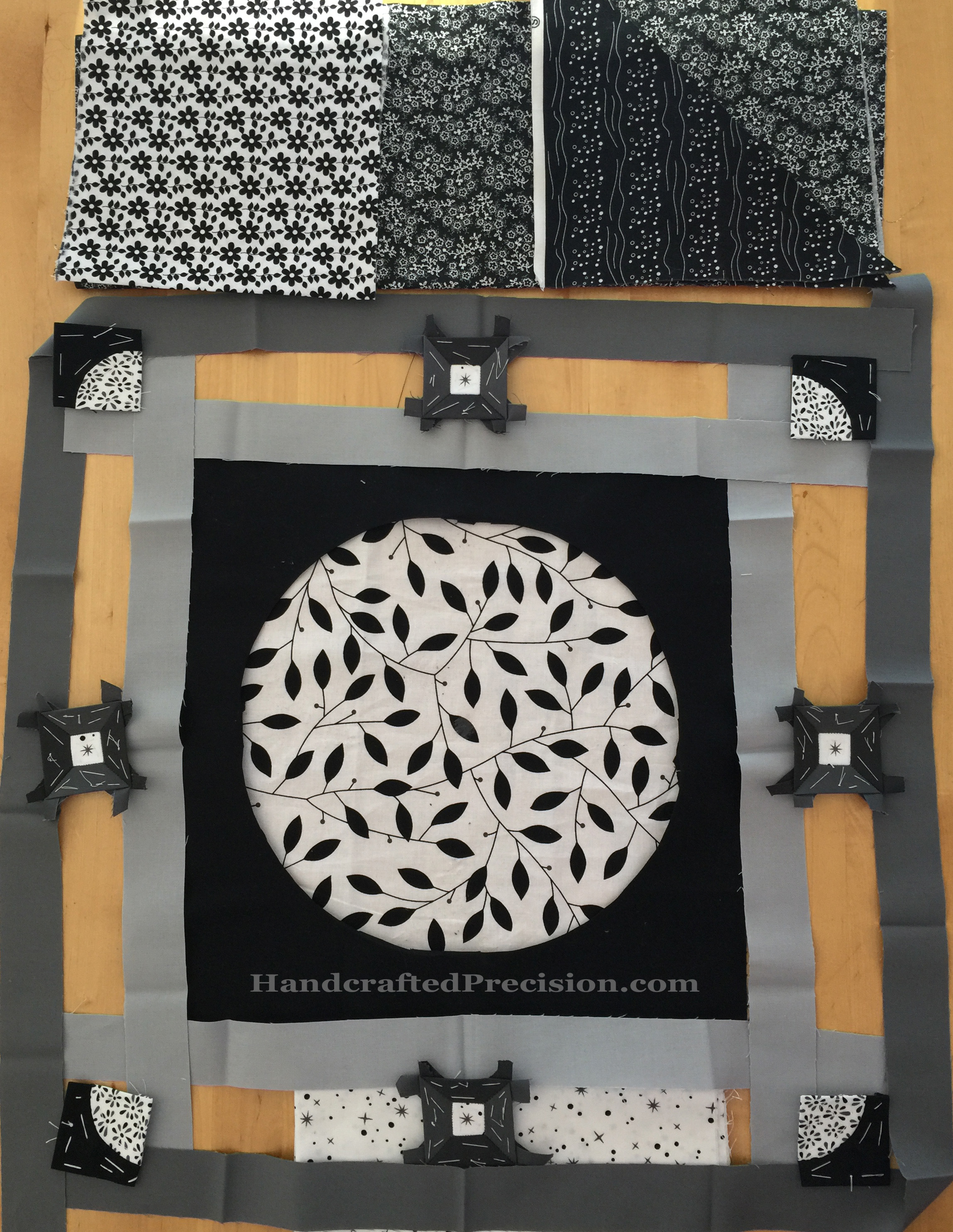
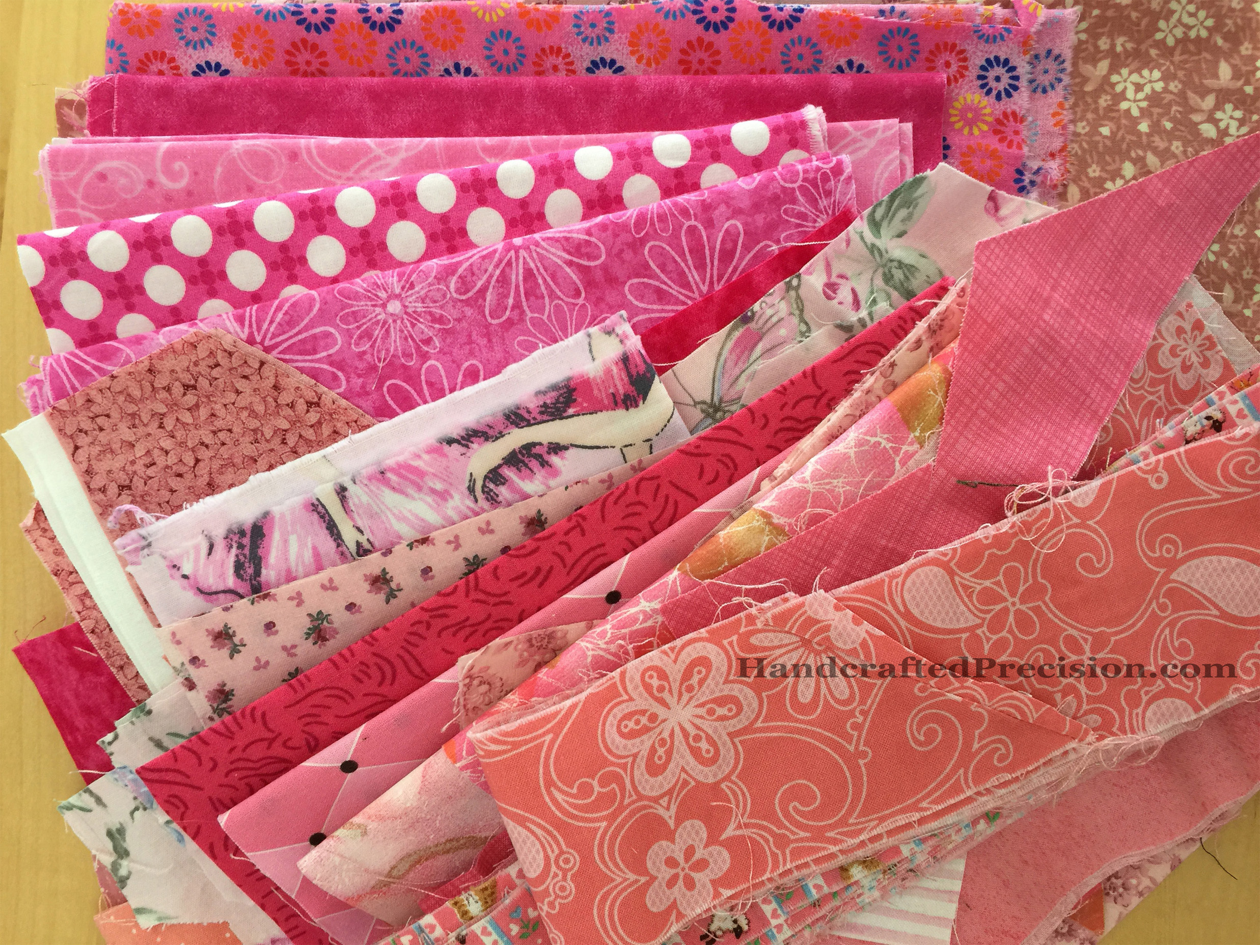
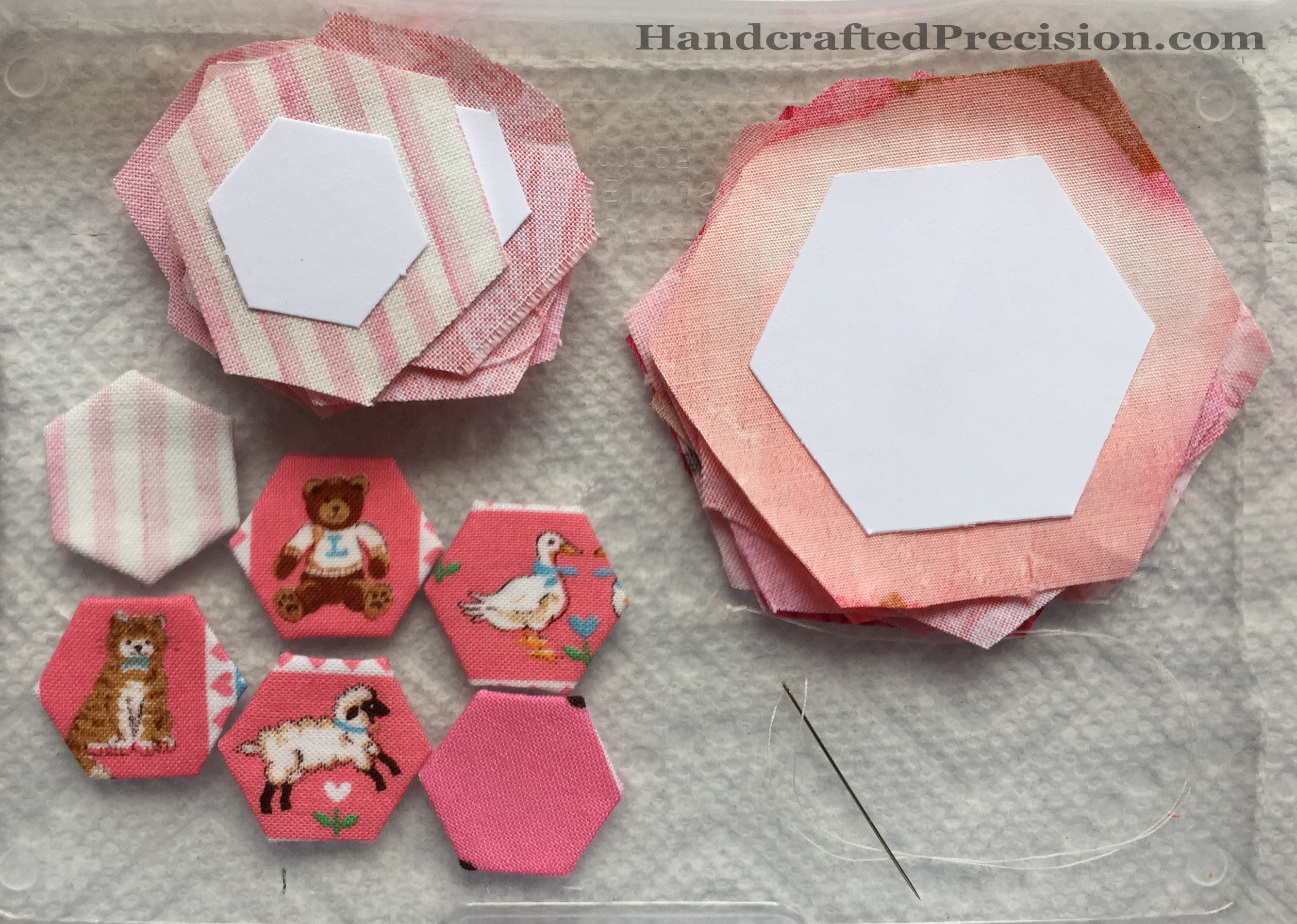
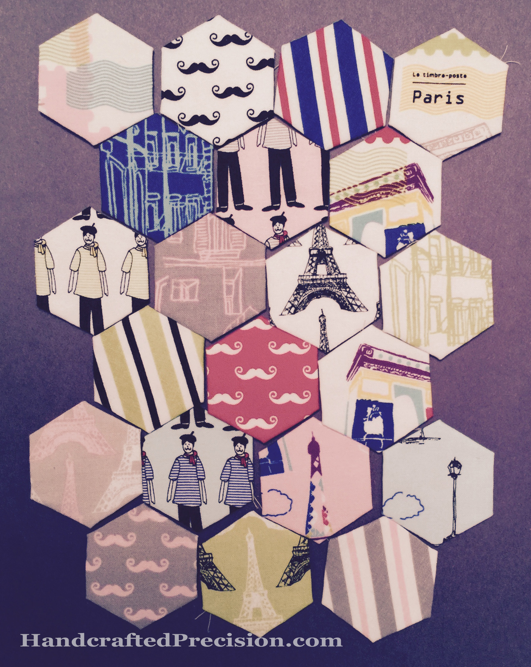
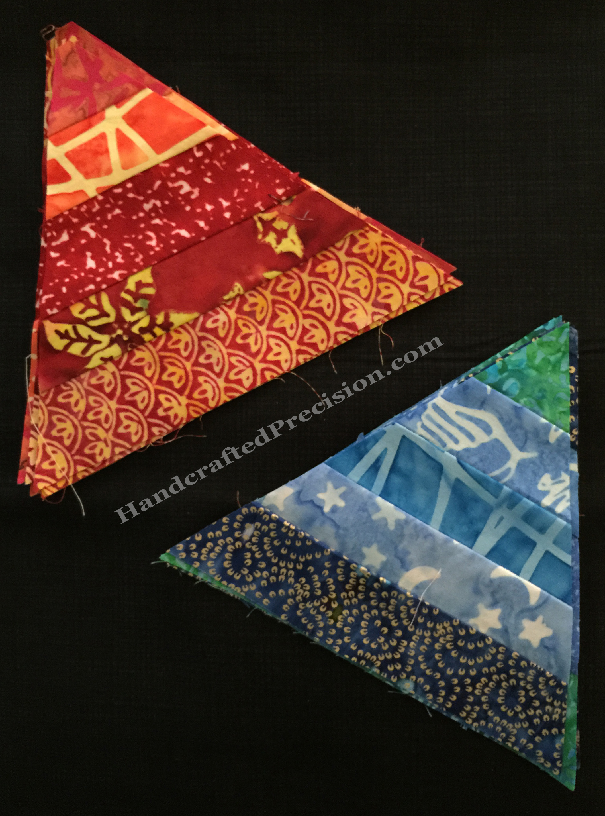
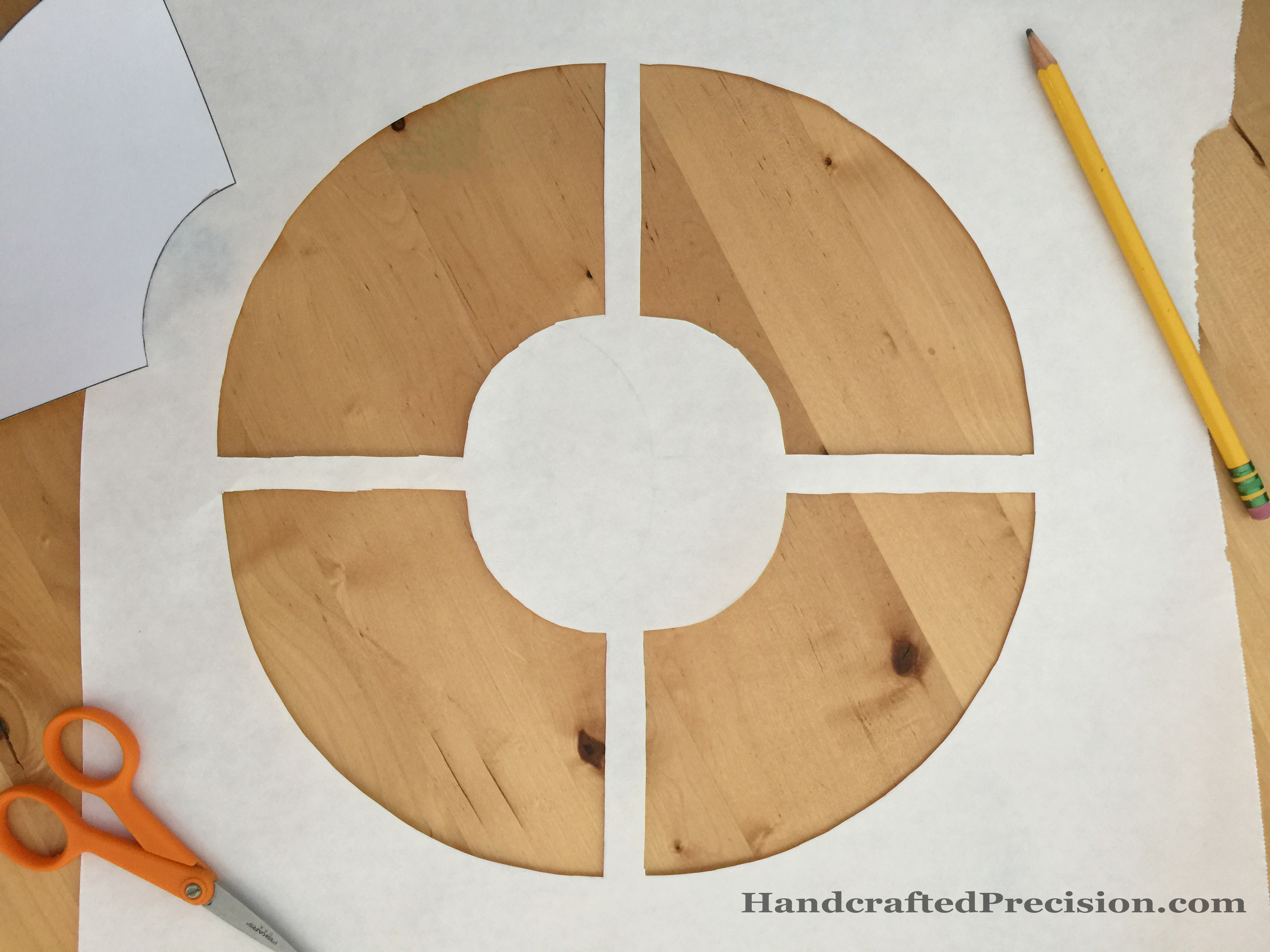
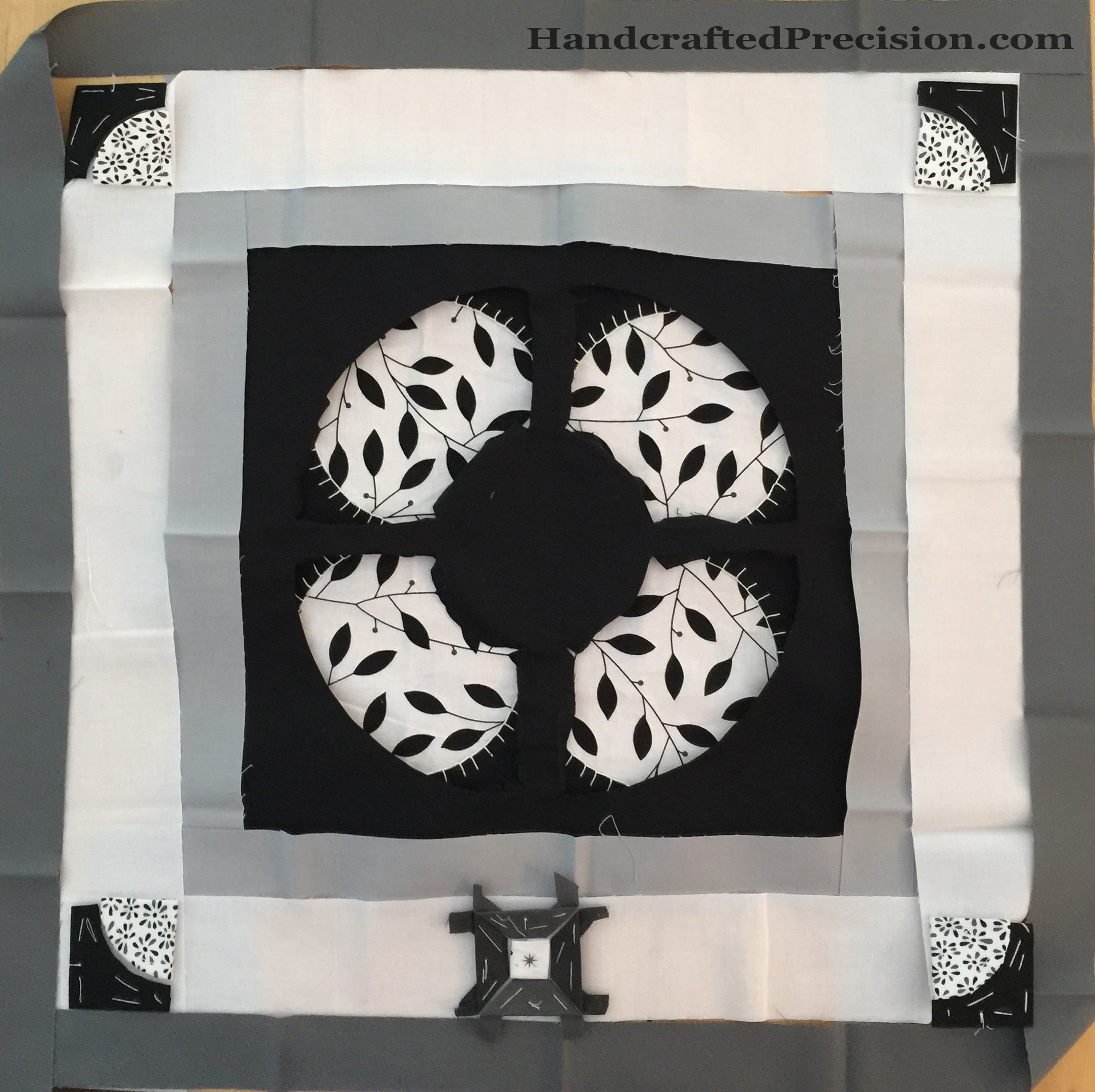
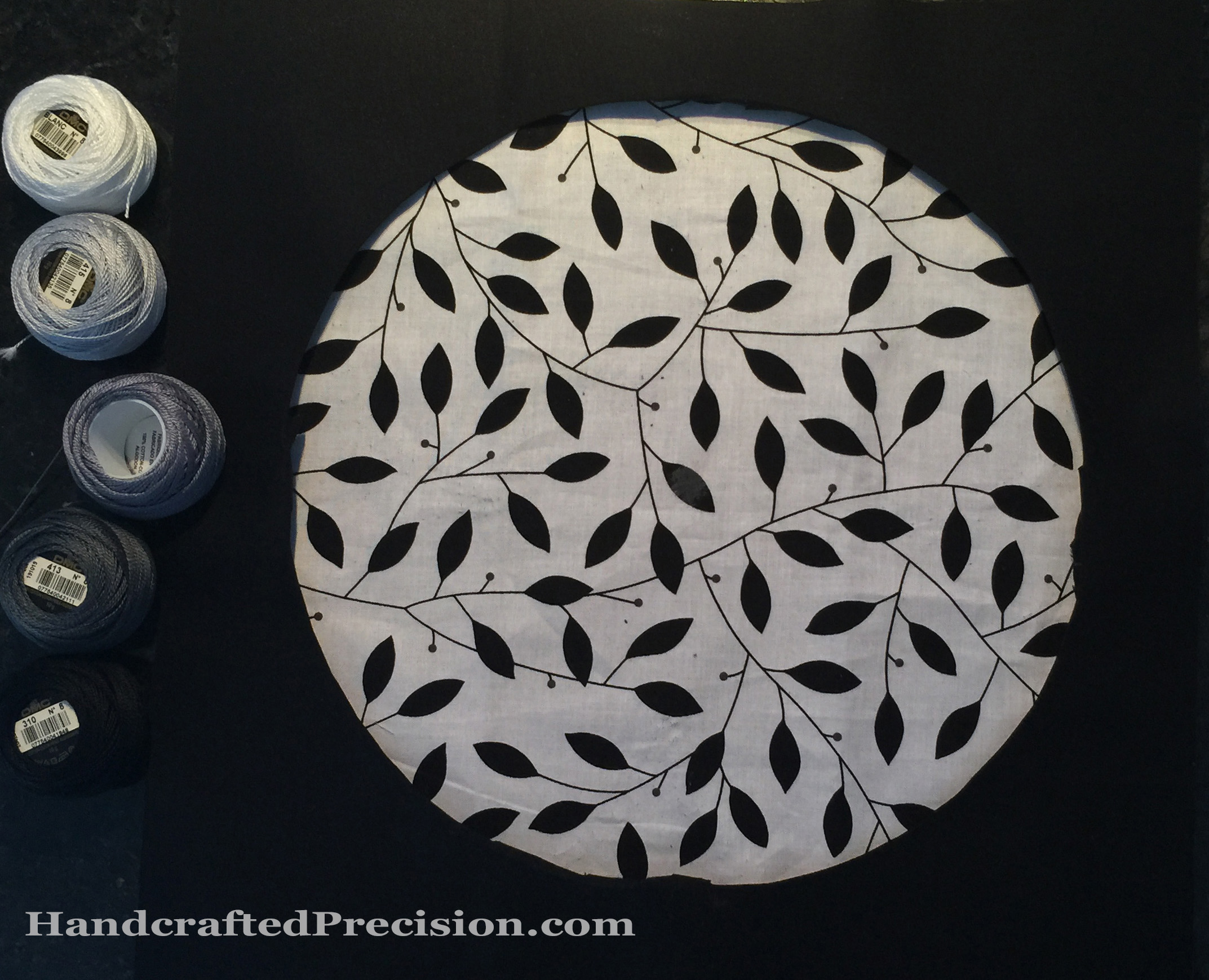
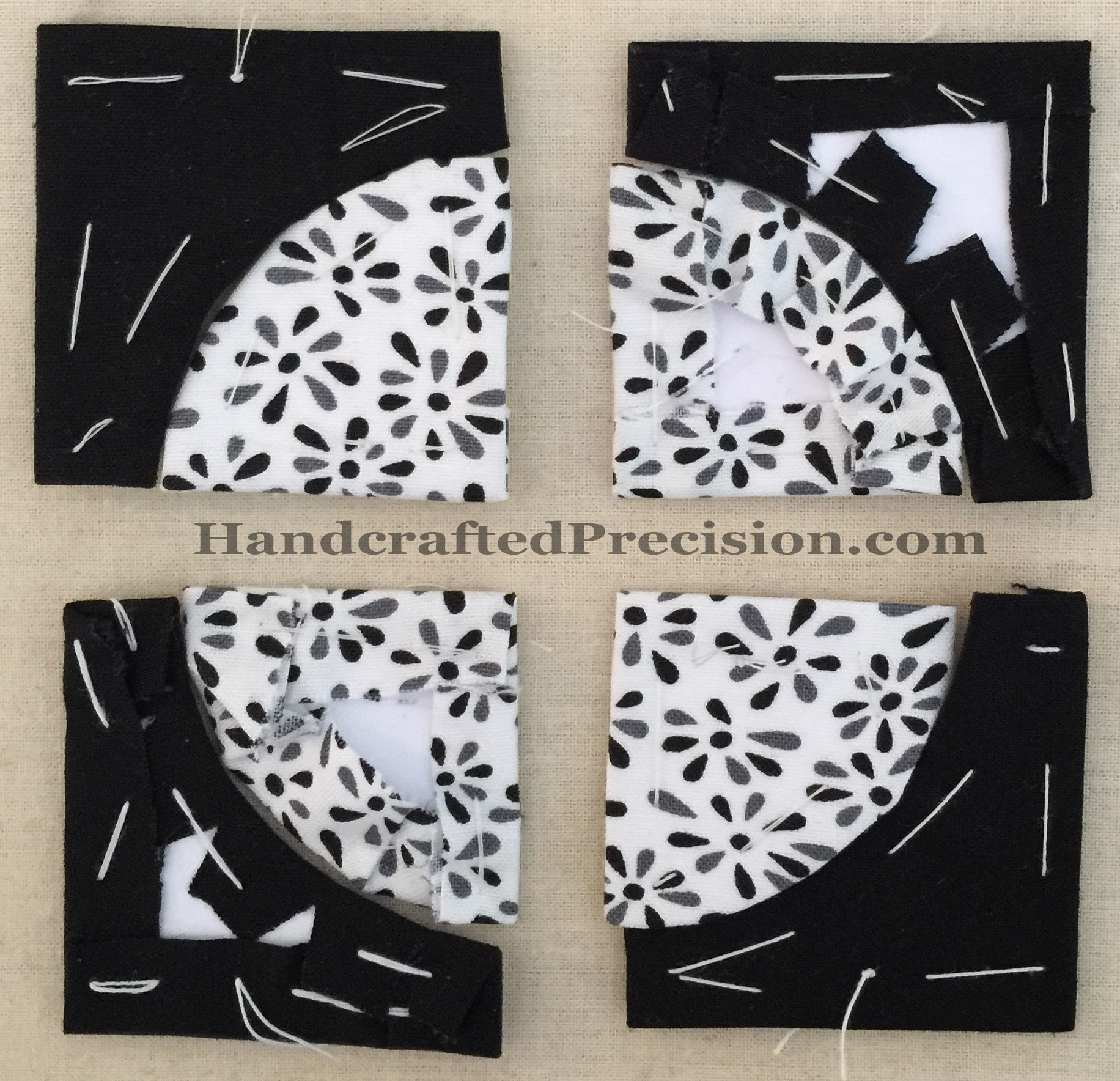
See how the print in the middle doesn’t grab you at all?  Also, I decided fairly early on to replace the fragile embroidery of the class quilt with English Paper Piecing (surprise), since if I ever finish this quilt, it’ll get heavy use as my couch blanket.  I love the corner 2″ Drunkard’s Path blocks (I made my own pieces for these, but they came together so well that I ordered more for the future since cutting them out precisely is no fun)–this was my first curved piecing of any kind, but the “jewels” (which I also drew, printed, and cut my own pattern for) centered in each row just don’t have enough contrast.  I also don’t love that splatter star low-volume fabric for this quilt.  The fabrics on the top are part of my ebay haul.  I thought I might need more variety, since I decided to embrace prints.

One of the prints that I ordered did have a motif that fit in the opening, but it was on a black background, so I used a blanket stitch to add some definition to the fact that it’s reverse applique:

Flower Medallion HP
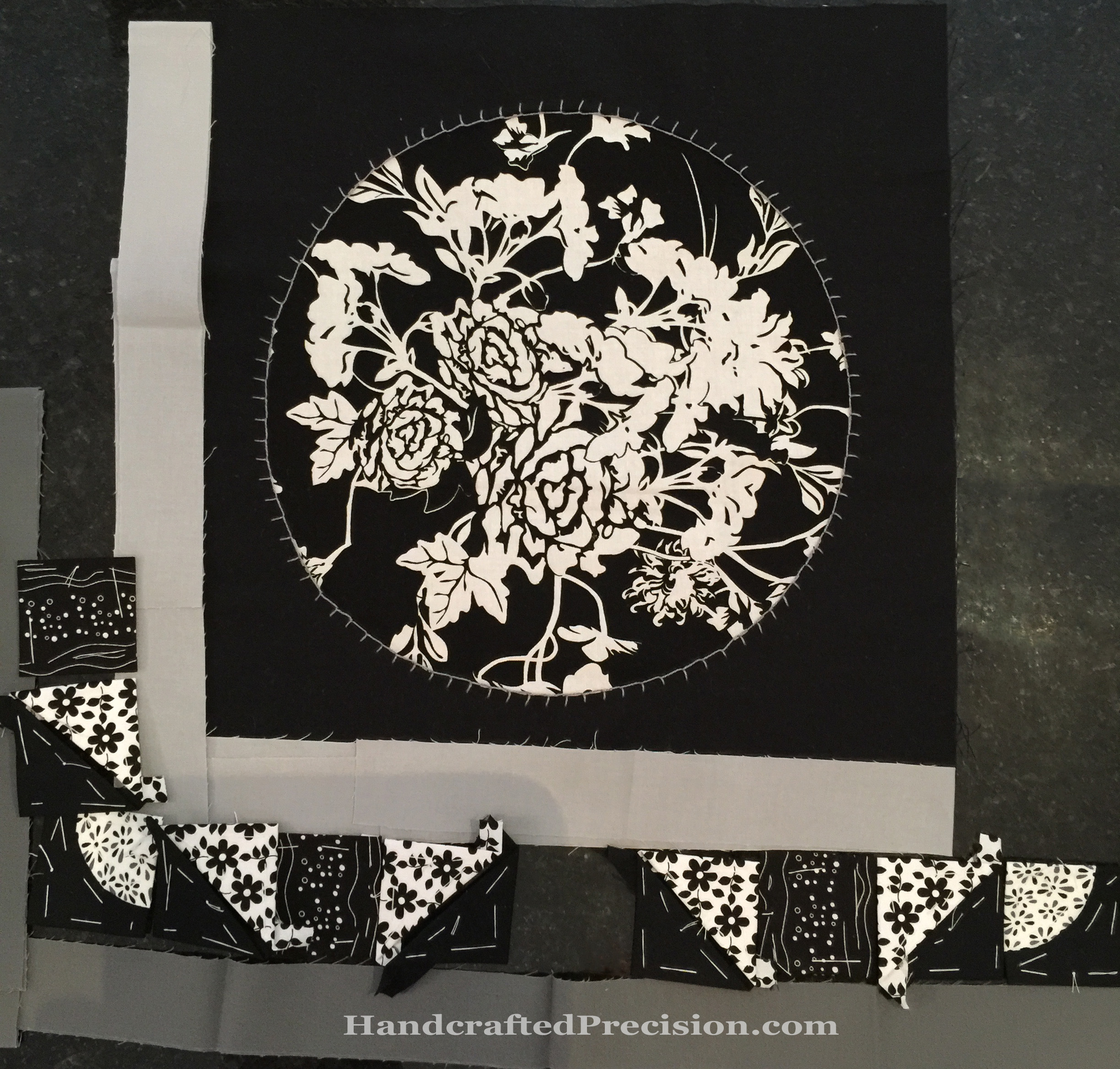
Better, but it didn’t thrill me, and there still wasn’t enough contrast or interest in the EPP row.  Also, the circle is very slightly off-center, which might bother me over time.  Short story: I didn’t keep it as the center, but I also didn’t rip it apart.  I think I might make a pillow out of it, since I need practice installing an invisible zipper anyway.

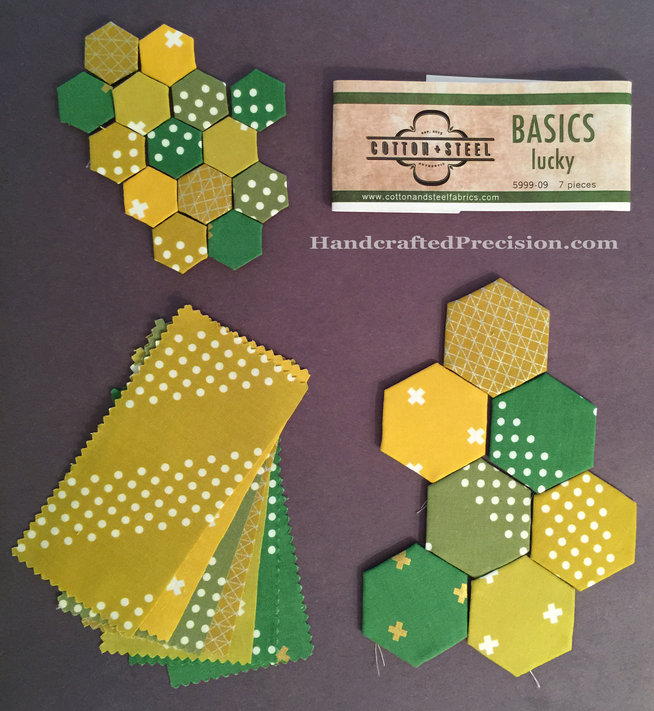
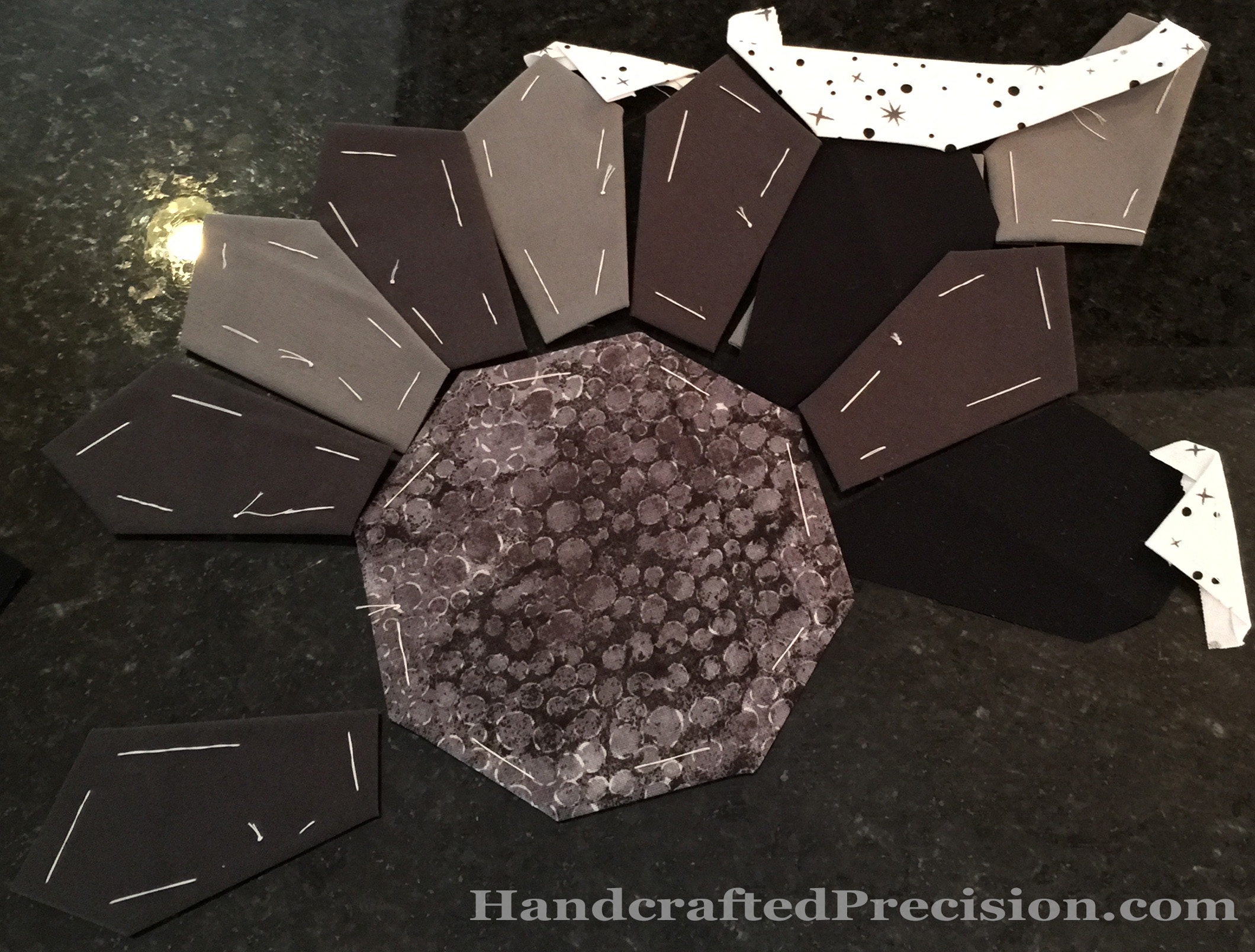
Because I was iffy about the prints, I also ordered papers for two full 12″ EPP  blocks, Carpenter’s Wheel and Chrysanthemum Octagon.  I’d been choosing fabrics based on a flowery theme, so I thought the flower in the middle might pull it all together, but I also really, really like the lines of the Carpenter’s Wheel (look at it greyscale!).  Drumroll:

Chrysanthemum HPI decided on the chrysanthemum.  Sorry for the terrible photo; it’s very much a shot I took in haste to illustrate my process.

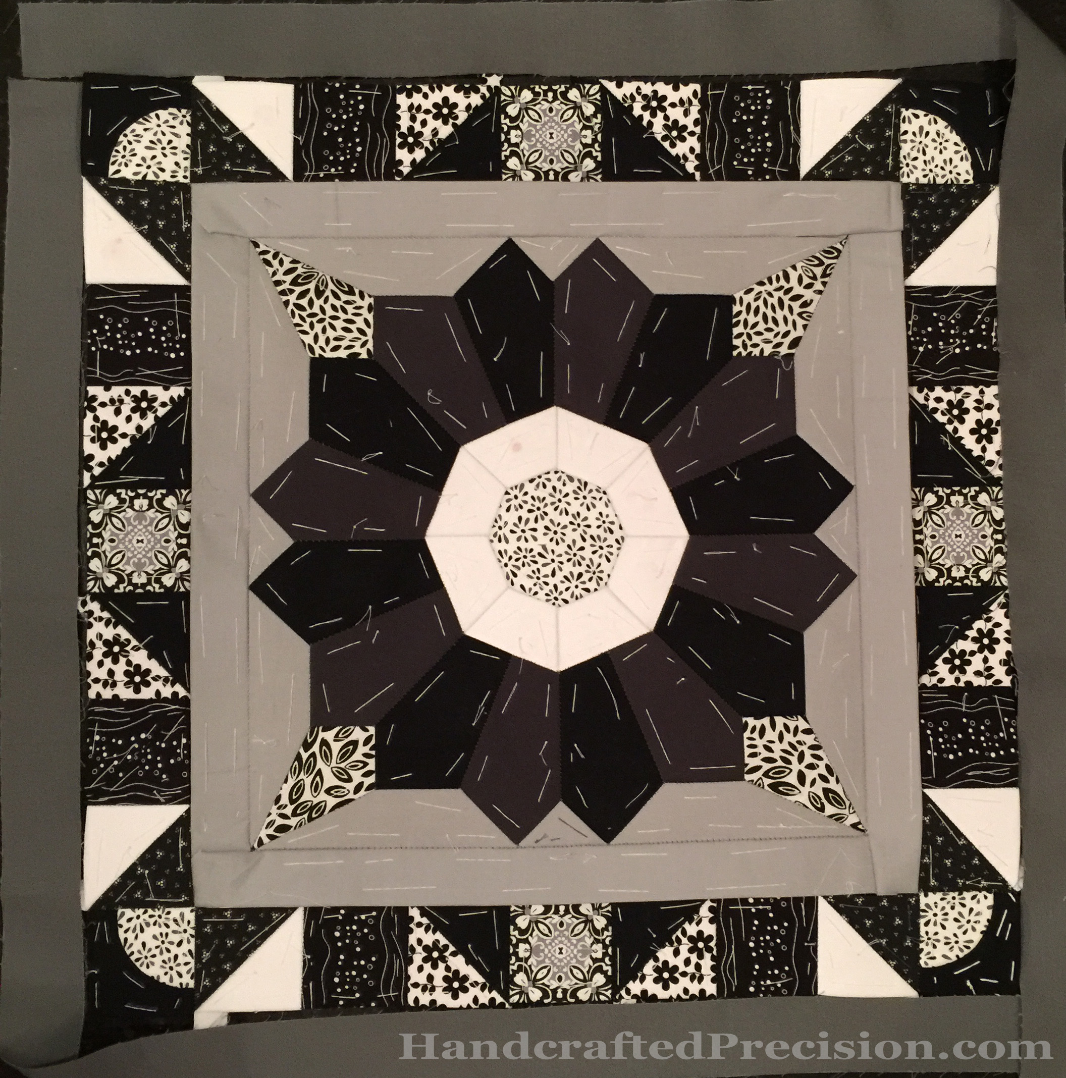
The light and dark grey petals didn’t work–too much contrast for it to read as a flower.  The black and dark grey worked much better (the photo doesn’t show the colors accurately).  The grey leaf in the corner works well as a lighter grey, but I still don’t like the starry-speckle white fabric.  I also HATE that fabric on the central octagon.  I don’t hate the fabric in general, but it doesn’t work at all with these other fabrics or for the feel of this quilt.

After much basting and testing and tracing new paper pieces and cutting and basting and sorrow, which I will spare you (and I didn’t take pictures of any more of it), I got to:

Chrysanthemum Medallion HP
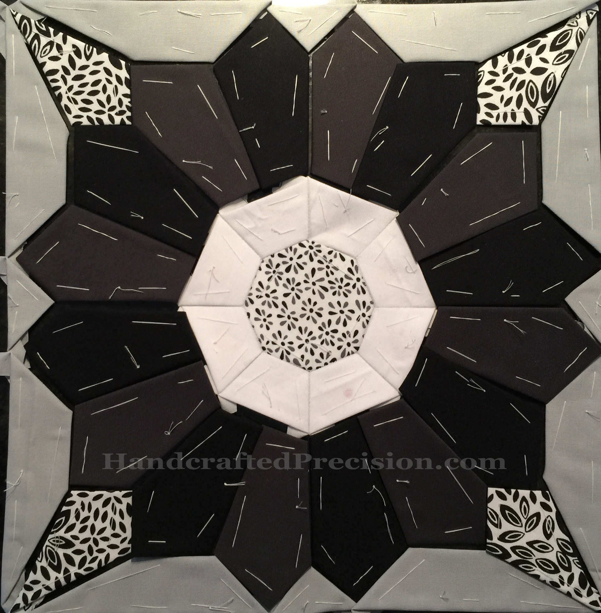
Again, the colors aren’t true, though that white round is WHITE.  I’m happy with it.  I don’t super-love it and you might notice that the central octagon is now nice pieces, but it’s okay.  I’m sure it will grow on me and it’ll match the EPP round.

I’m very excited to have finally made a decision (and gotten everything basted and even a little sewn together), and I think the fabric choices for the rest of the quilt are becoming much more obvious for me.  Also, these points are the sharpest I’ve ever EPPed, so I’m learning in this block, too, besides all of the color (well, value, since it’s all black/white/grey) theory I’m soaking up by trial and error.

I’m going to call this quilt “Midnight Garden” and will update tags on the previous posts when I have time.

Star Wall Hanging

I thought long and hard about my February goal for A Lovely Year of Finishes, and realized that I barely have time for anything in February since I’m working on the Handstitched class quilt.  But then I remembered a simple finish which will let me practice straight-line machine quilting.

During one of the scrap classes at my local quilt shop, we made strata and cut sixty-degree triangles.  They were supposed to finish in a star on a white background, which I bought the fabric for, fully intending to finish quickly.  Like so:

Traingle Star on White HP

For the scrap class post, I took a picture of them on my favorite black background and LOVED it:

Pieced Triangles Warm & Cool HP

So I’m going to assemble to star on the back background, machine quilt it, and try an all-machine binding.  I will need to trim the triangles to all the same size since I used different rulers in class, I should be able to handle that in a month.

Best Black Fabric HP

I ordered more of my favorite photo background black, which is Lily’s Garden from the Lily’s Linen line by Patrick Lose for RJR Fabrics.  I don’t know why I love it so much, but I just do.

I’m linking up with ALYoF.  (EDIT: Or not, since I guess I missed it this month.  I’m still going to work on this wall hanging, but I’m actually relieved not to have to push to finish it if I have other things going on.)

Charm Pack – Basics Lucky

I got a little frustrated with mini charm (2.5″ squares) packs because the large patterns in a collection tend to be lost even on a 1″ hexagon while still not giving me much variety for my 1/2″ hexagons.  On the plus side, they’re cheap and even more so with my subscription to Fat Quarter Shop’s Moda Mini Charm Pack Club.  (And I got a bunch of them during a very good sale.)

CP Cotton Steel Basics Lucky HP

So I decided to try a charm (5″ squares) pack.  This is Basics Lucky from Cotton and Steel.  It’s a short stack (only seven designs), and the price was right when I came across it in my local quilt shop.

I realized that I could use those leftover 5″ by 2″ to 2.5″ (depending on how precisely I cut around the hexagons) rectangles for SCRAPPY COIN QUILTS!  Duh!  l love it!

It’s a little more work to cut up a charm pack like this, vs the mini charms where I only had to trim the corners off the fabric I lightly glued to the 1″ hexagons before I thread basted them.  Cutting around the 1/2″ hexagons is a bear either way.

It wasn’t too bad, but I’m still thinking about a die cutter if I’m going to make this a habit.

I also learned that “black” construction paper isn’t really black and it’s very spotty and needs lots of evening out in Photoshop.

Class Quilt New Plan

Ugh.  Well, the new center was looking a little Pokeball to me.  I think the strips beside the windows were too narrow, so I hacked them out and the center’s now a reverse-appliques circle.  Or, it will be, once I choose a new feature fabric.   <sigh>  Let me backtrack a little.

I’d decided on breaking up the expanse of black-on-white leaf fabric with a connected circle in a circle.  The freezer paper template:

New Freezer Paper Center HPI should have known that those connecting bars were too narrow.  Also, when I folded back and pressed the black background fabric, I had the same problem as with the dogwood blossom, though not as severe: those corners suck.

I agonized a lot (what’s new?) and laid the new black background over the old dogwood blossom that was already appliqued.  I also took out the strips I’d cut for the next borders and the bits of the EPP that I’d basted since I decided to change things up last week.

Class Quilt Mock-Up with New Center HP[As an aside, in thumbnail, this shape of the flower that appears when I have the circle over the dogwood blossom is quite appealing to me.  Maybe I’ll do something like that someday–but not today.]

So, good, circles in the center and little EPPed Drunkard’s Path blocks, dogwood “jewel” replaced with fussy-cut star (the smallest paper piece I’ve used yet!) surrounded by greys.  But the bad was the more I stared at it, the more I hated those thin dividers and the central circle.

Circular Central Medallion HP

So I cut them out.  That central fabric still isn’t “important” enough for this medallion, but I’ve ordered a couple prints with big motifs I think might work.  Since I’m not going to do all of the embroidery, I’m not in a giant rush since I have two more weeks to get everything in the mock-up above done and sewn together.

Here’s a close-up of the basted Drunkard’s Path blocks (each 2″ square), front and back in one picture:

Drunkard's Path EPP HP

You might notice that I still have three square “slots” between each EPPed section in the handwork round.  What do I plan to put there?   I was thinking about doing a HST of greys on either side of the Drunkard’s Path block, then a solid square of the black-on-white low-volume stars fabric, then another HST of greys, but I don’t know if it’ll work.  Something like this:

Handwork Round Mockup HP Colors

But I honestly have no idea what’ll look good.  Suggestions are very, very welcome!

Thanks in advance!

Finished Nightstand Topper!

Berries with Lemon Action DONE HPDone and in use, my first A Lovely Year of Finishes finish, the nightstand topper for my son Sec, “Berries with Lemon”!

It all started with his fabric picks and here we are with a functional piece.

Berries with Lemon Front DONE HP

It’s a tiny bit wonky, but it almost perfectly fits his night stand.  I ended up just doing bar tacks at some of the brick intersections by hand.  It’s not going to be washed much (as you can see from the first picture, he doesn’t like putting his water cups on it), so it should hold together just fine.  No, he doesn’t really use the clock for anything.  He claimed it from another room and now it’s his.

The bar tacks were partly because I couldn’t bear to drag out my sewing machine to do the quilting.  I despair of ever being able to sew a consistent, straight line without a struggle.  Good thing I like hand-sewing now, though burying the knots and ends of all of those bar tacks was no fun at all.

Berries with Lemon Back DONE HPI do like the back.  I don’t want to mess it up with a big ugly white label and I’m not sure I can easily match the red for a Spoonflower-printed label, so we’ll see.

But it’s done and getting used, so YAY!

Linking up with ALYoF’s January finish post, just in time.

The Hexagon Diamonds Blues

The title is descriptive of the photo and of my mood.

Blue Hexagon Diamonds HP

The diamond on the right is pretty clearly light blue, though some hexagons are more greenish or greyish.  That just adds interest.  The one on the left is just barely darker than the “medium blue” one in the middle.

I’m not going to sew any of these up.  They’ll just go back into the “blue” container as loose, basted hexagons.

I do think that I learned I only need two shades of blue for I’m Not a Machine, though, and maybe greenish-blue, if I have enough fabrics in that shade, which I doubt.

All told, I learned a lot about color and value this month, even if I didn’t get much done besides basting.  I’m looking forward to next month’s color.  I hope it’s an easier one, like orange.

Linking to soscrappy’s RSC.