Starting tonight (and for the next nine weeks), I’m taking the Handstitched class by Rachel from Stitched in Color. I’m really looking forward to it–especially making the hand stitched class quilt, Modern Medallion. Here, she features some students’ class projects. It’s nice to see all of the different colorways for the quilt. Look at this FABULOUS muted and slightly modified version by Happy Go Lizzie on Flickr. (Please excuse my laser focus on the quilt. It’s crept into my dreams).
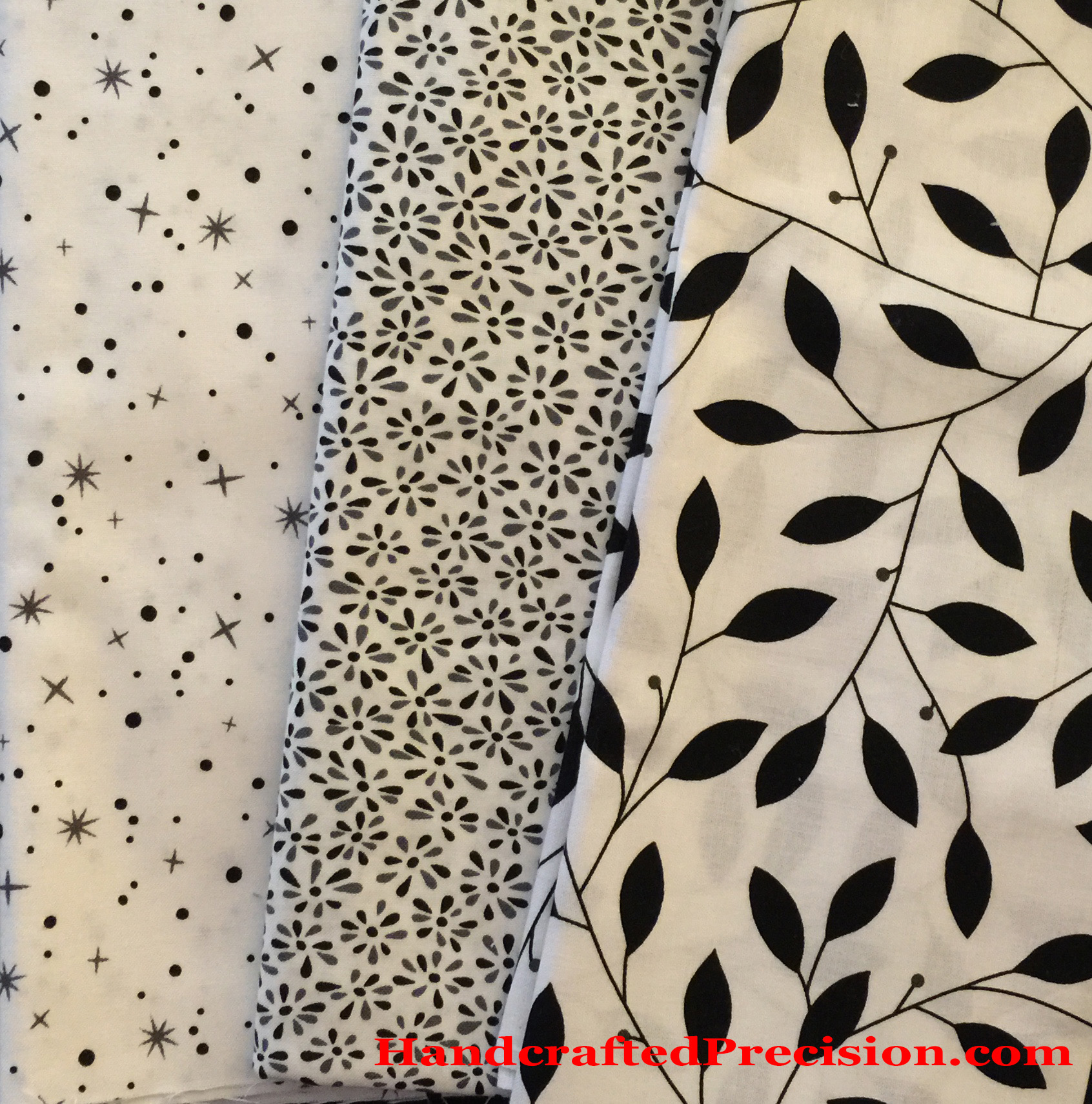
I’m going to do a black/white/grey version, though I still have some decisions to make, like “Should I use the left-hand print in the photo, the right-hand, or neither as my central dogwood blossom?” The prints are actually shades of grey and black on a white ground–my lighting was not so good.
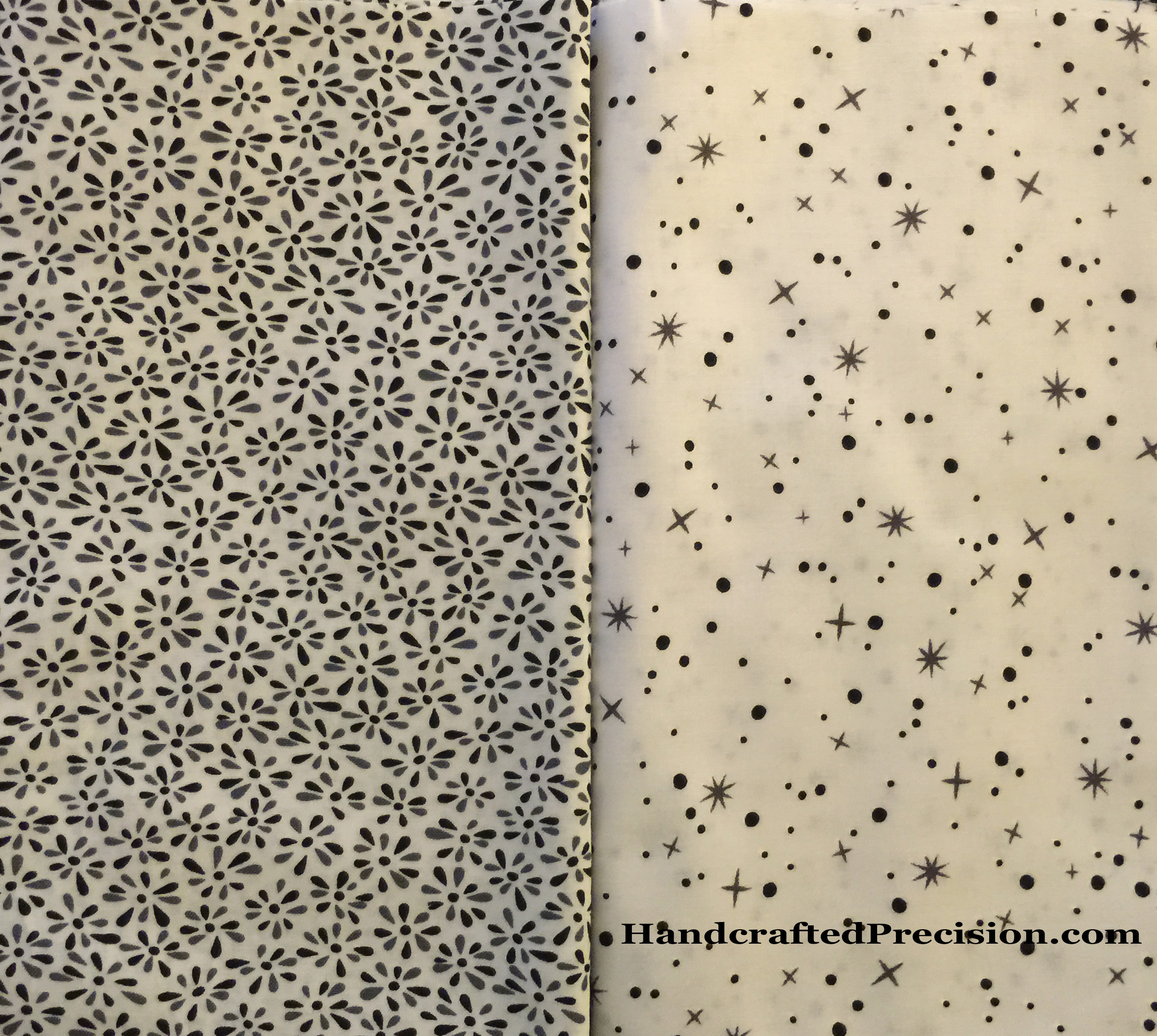 I was thinking about going with a white blossom and embroidering or hand-quilting in some detail and interest, but I really like these prints. I might use the more open one (on the right) in the central blossom and both elsewhere (there are some little dogwood blossoms in a later round, and the print on the left could easily mix in with the various greys for the square patchwork section).
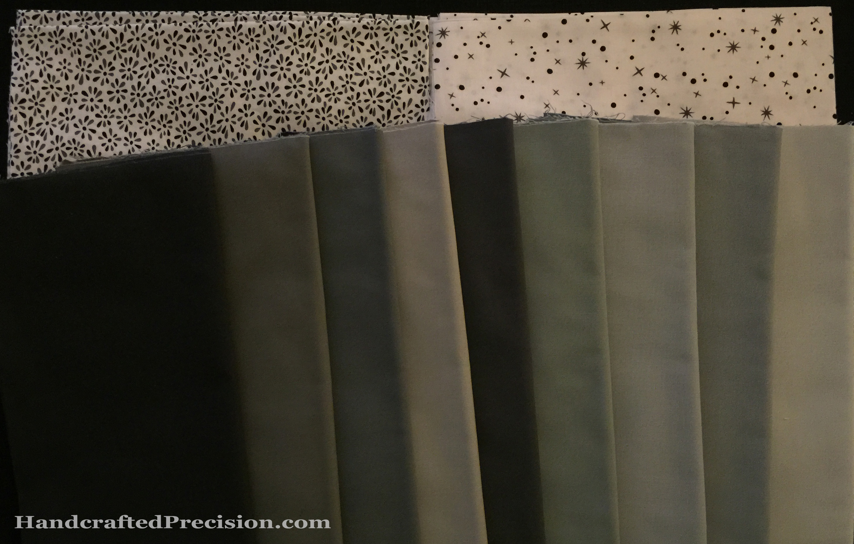 Here the prints are in the same terrible light with the greys I got. They’re all sitting on black. I didn’t include the yards of black and white that I bought in the picture.
I need some good natural light before I decide which of the greys I’m going to use. Some don’t look pure grey. I love Fat Quarter Shop, but I wish they’d use stickers to label the individual cuts of fabric, to make it easy for me to identify which grey is which (the names are all fairly similar–different ways of saying “grey”).
Your thoughts about the prints (vs white with embroidery) are welcome in the comments!